#4, Good point Seer, it is bigger but Wii boxes are also longer than normal boxes and I changed that in accordance, I like it that way and I were'nt going for realism, it's after all concept art I used but thanks again for the comments. More ratings please.
#10, um... o....kay.... anyways, nice box art, it has a great simplistic style and is sharp an al that kinda stuff that makes somethign look good. 4.5/5
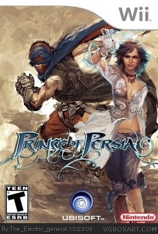
 Prince of Persia 4 Box Cover Comments
4 boxarts in day ! Your on a roll today !
[ Reply ]
very cool.
why so many at once though?
you have like, a stock pile of boxes saved up? haha
[ Reply ]
Well I've been very busy lately so these box ideas have been gathering up over the last weeks, glad you like em.
[ Reply ]
thats sooo neato
it looks soo cool i love it
teh only thing is that the teen and ubisoft logos might be a little bit too large
[ Reply ]
The Teen and the Ubisoft logo are find . You change the rateing M or RP .
[ Reply ]
#4, Good point Seer, it is bigger but Wii boxes are also longer than normal boxes and I changed that in accordance, I like it that way and I were'nt going for realism, it's after all concept art I used but thanks again for the comments. More ratings please.
[ Reply ]
Wonderful job, I really like this one :3 4.5
[ Reply ]
I can the see as the offical boxart.
[ Reply ]
5/5
[ Reply ]
That chick looks like a dude!... interesting....
[ Reply ]
#10, um... o....kay.... anyways, nice box art, it has a great simplistic style and is sharp an al that kinda stuff that makes somethign look good. 4.5/5
[ Reply ]
Its ranked #13 now which is great.
Thanks for comments and votes guys.
[ Reply ]
5/5 absalutely perfect!
[ Reply ]
#5, again it's *fine* not *find* , 5/5
[ Reply ]
Thanks guys.
[ Reply ]
AMAZING! :D
[ Reply ]