
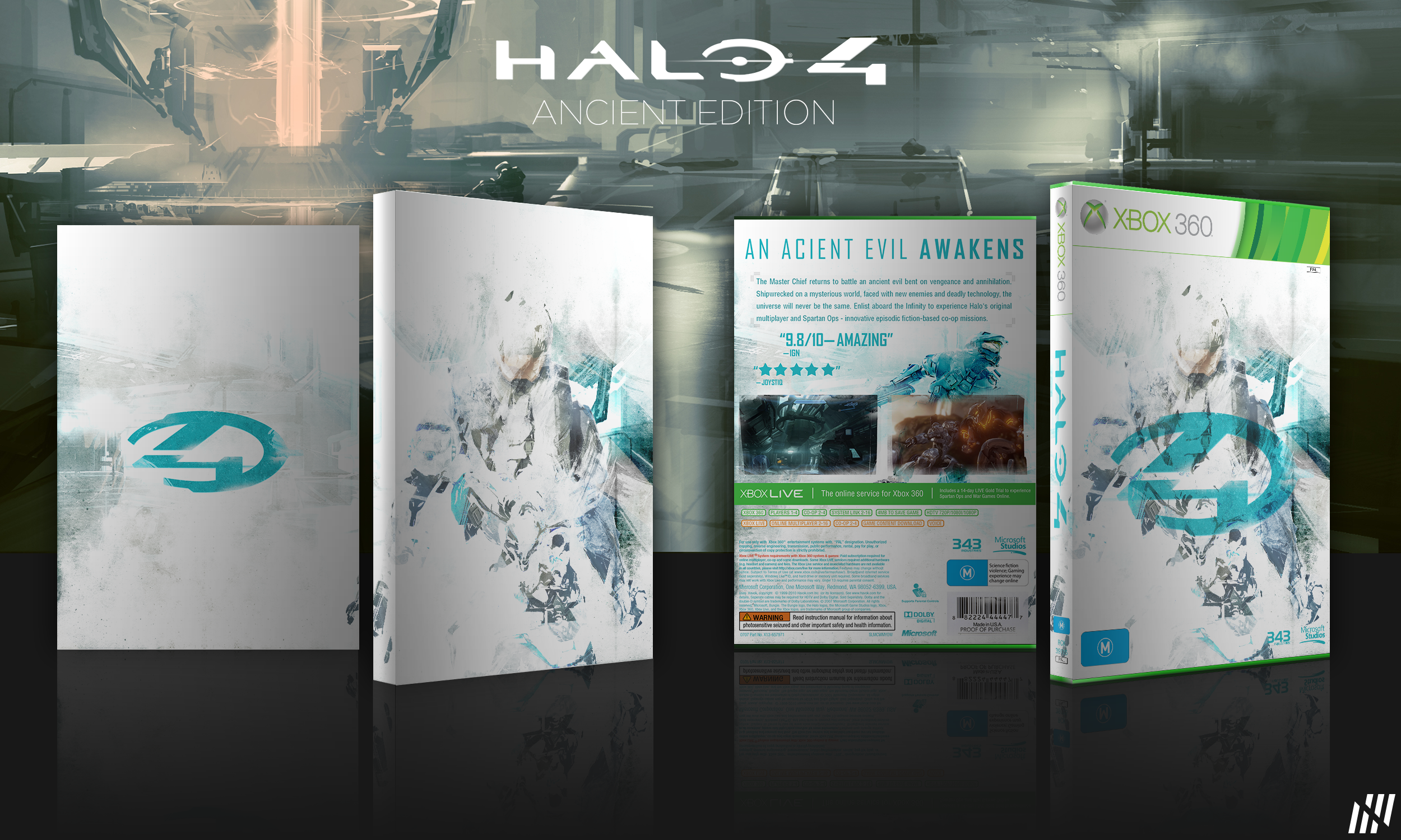
Halo 4 - Ancient Edition
I wanted to make a light cover for Halo 4, most of the ones I've seen have been dark so I thought I'd experiment with lightness. The box on the left is the sleeve for it and the one on the right is obviously the cover.
I'd love to hear what you all think =)
[UPDATED] Fixed the typo on the back cover.
[ Box updated on December 18th, 2012 ] [ original ]
 Halo 4 Box Cover Comments
Comment on designbynuro's Halo 4 Box Art / Cover.
very good :)
[ Reply ]
Nice Job Man . . .
[ Reply ]
I like the clean cover (the sleeve). I don't like the front. It feels disorientated and too much. The back si solid, but nothing special.
But the sleeve looks real nice in its simplistic way.
[ Reply ]
I'm going to love your STYLE , o_O
[ Reply ]
Its not too bad. I think the front is pretty nice but it is reminding me too much of your last box with the whole faded grunge brush effect you have going on. And I am personally not a fan of the turquoise theme at all, I dont think it works. Not too sure why master chief is entirely turquoise on the back either...
So its not too bad but Im not really a fan of this personally.
[ Reply ]
Thanks heaps for your honest feedback dude, much appreciated. I went with turquoise because personally I like the colour and I wanted to find a middle ground between green and blue which are the primary colours in almost every halo box I've seen. The Master Chief is entirely that colour on the back because if I had him in his full normal colours it would have clashed with the screenshots as they have no border and have faded edges. If I had him in black and white or grey it wouldn't have stood out. Thanks again for the feedback =)
[ Reply ]
Great design man, one of the best Halo 4 boxes on the site imo - love the mix between the grunge and really clean styles you have here. Also really reminiscent of the Halo 2 collector's edition boxset - awesome stuff! Keep up the good work.
[ Reply ]
Thanks Patches! To be honest I drew a lot of inspiration from the Halo 2 Steelbook edition. It was really minimal but still looked great so I wanted to try a similar approach with the sleeve.
[ Reply ]
Very nice, I like it. But the lighting from the presentation kinda throws off the bright style of the box.
[ Reply ]
"An acient evil awakens."
Spelled "ancient" wrong.
[ Reply ]
Thanks Darby, simple typo. I will be updating it shortly =)
[ Reply ]
Thanks heaps guys. Glad you like it.
[ Reply ]
Back is nice. Front not so much. I suggest you make Master a bit more visible then it'll be perfect.
[ Reply ]
I think that overall, this is a pretty good job. I don't think that the front art for the cover itself is fitting though, and the back feels empty. I like it as a whole though, good job.
[ Reply ]
The color association throughout the box is stellar. I quite like the front design.
My only qualm is the Halo 4 Symbol in the front. I'd prefer the title instead. If that could be changed... I'D LOVE A PRINTABLE!!! :)
[ Reply ]