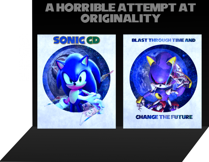
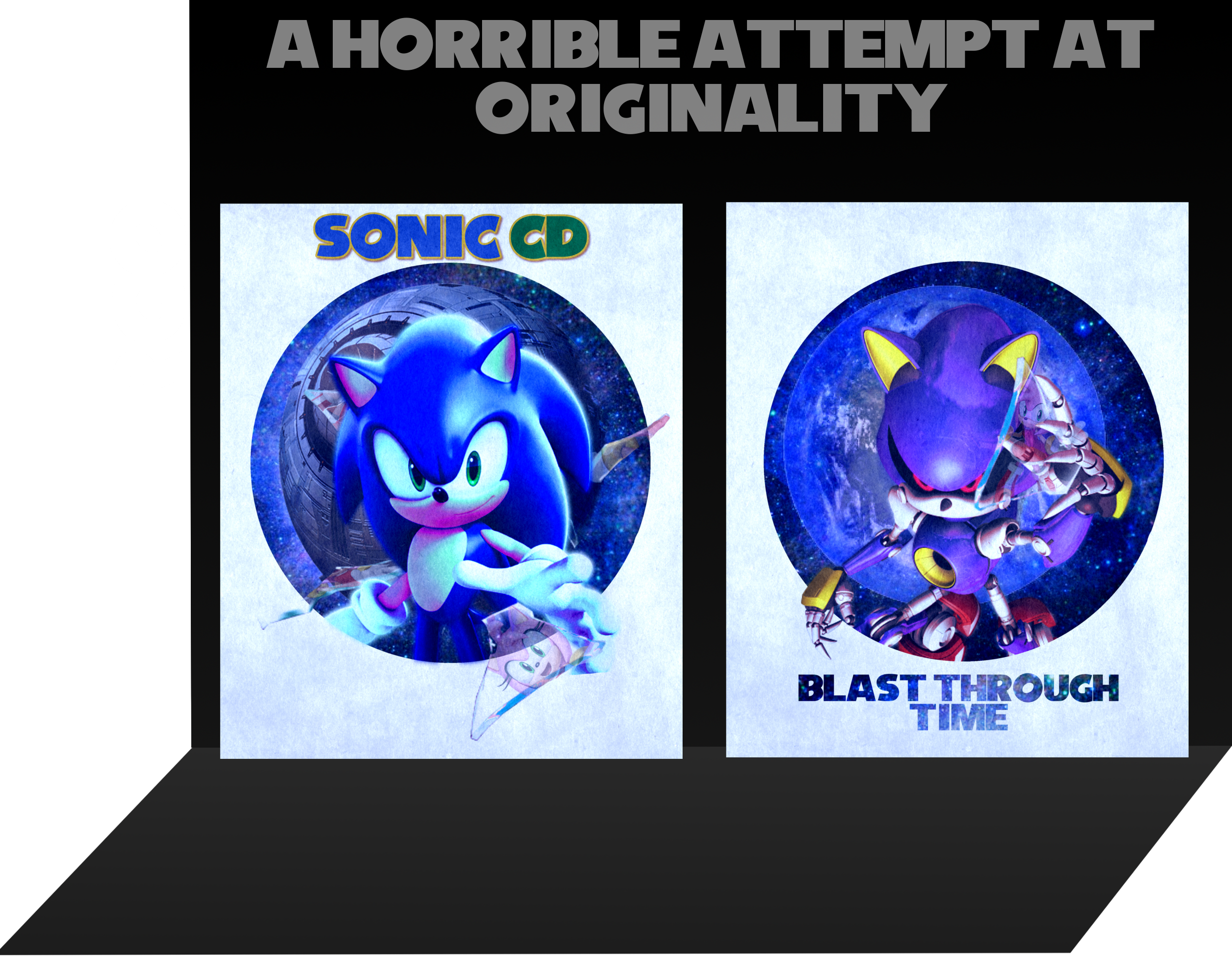
I was working on this during my previous box. It's my most complicated box ever, and here's the history:
It started out as a Mario & Wario box. Then CD. Then a fake game based off of nothing but Sonic. Then Generations 2. Then CD again.
It's also the most complex box I've made with a simple design (the Amys on the glass were tricky to add on.)
Renders from Sonic News Network, Sonic Retro, and google. Fonts aren't mine.
[ Box updated on February 3rd, 2013 ] [ original ]
 Sonic CD Box Cover Comments
Comment on Ergo's Sonic CD Box Art / Cover.
Pretty awesome. But that damn text gets to me every time.
[ Reply ]
"But that damn text gets to me every time."
Is that a good thing or bad thing? :P
[ Reply ]
@Ergo Bad thing haha. It's kinda annoying when it's so prominent. It could be there, but make it smaller.
[ Reply ]
Updated. Better?
[ Reply ]
@Ergo Oui.
[ Reply ]
>posts Sonic CD box
>gets little after several hours
>Ergo posts Sonic CD
>6 favourites within an hour
>mfw
*ahem* Nice design but personally, I think it could use more. Minimalism is nice, but this is TOO minimalistic to be thought of as a game case or even a jacket. Nonetheless, I love the touch you did with Amy and the shards of glass. +fav
[ Reply ]
Addition: Some of the renders also look a little blurry such as the glass shards and images of the Little Planet and the roboticized Little Planet.
[ Reply ]
Thanks.
The really awkward part is we borrowed almost the same Sonic pose.
[ Reply ]
Also, it was another side project.
Then again, my top box was "just a pet project".
[ Reply ]
@Arby Works (second post) - I honestly can't do anything about those (and actually, the regular Little Planet was just an Earth render). All of those pretty much only have one image, and the robo-Lil' Planet was edited off of an already existing image.
[ Reply ]
@Ergo Almost. I chose the other one because of the intro of Sonic CD where Sonic first spots the chained up Little Planet. Maximum awkward if I had used the other render... ('o_o)
@2nd: I understand. Maybe a little brush-tool to make the outside not seem so choppy. Regardless, lovely concept.
[ Reply ]
It looks nice, but a little too much blue. Well done.
[ Reply ]
original? you COMPLETELY copied my circle design
link
kinda offended really
[ Reply ]
seriously tho good box you're improving
[ Reply ]
no it haz 3d ya bish
ps thnks
[ Reply ]
The most impressive thing in it is the "glass-Amy" thing
[ Reply ]
Realy like your style.
[ Reply ]