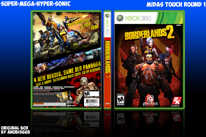
Round 1 of Midas Touch against Martiniii and RunawayRed.
Original: link
[ Box updated on March 2nd, 2013 ] [ original ]
 Borderlands 2 Box Cover Comments
Comment on super-mega-hyper-sonic's Borderlands 2 Box Art / Cover.

I hate that spine, but everything else looks great.
[ Reply ]
Yeah I didn't really know what to do with it.
[ Reply ]
The only ..... part is spine , try to fix it , o_O
[ Reply ]
Agreed with Ergo, I wish the spine was coded in color as the front and back, but this is pretty legit, good luck in the round.
[ Reply ]
You too.
[ Reply ]
Okay I have tried to fix the spine. Hopefully it's better.
[ Reply ]
Lovely, especially the back
[ Reply ]
it says igm
[ Reply ]
So did the original.
[ Reply ]
Bonus Points!
[ Reply ]
like this if you are a strong ryan palmer who dont need no mub
[ Reply ]
le like
(im just kiddin i need u bbz)
[ Reply ]
Perfect box that really resembles the original in layout, great for the comp.
[ Reply ]
I want all my good friends to cover your new body. Please advise if there is a problem I want to modify
link
[ Reply ]
Wow. Excellent job. Really fits the original.
[ Reply ]
One of your best boxes. I especially like the front.
However, the presentation really puts me off - that blue color - doesn't match well and looks unprofessional. If you want a gradient presentation, I recommend sticking with simple white/black gradient.
[ Reply ]
I just wanted something to contrast the red to make the box stand out. I will try and come up with a better way of presenting my boxes in the future.
[ Reply ]
@super-mega-hyper-sonic Believe me, black/white gradient work for any box regardless of its color scheme. Simple white background would have also worked well for this one since the box itself is comprised of darker colors.
[ Reply ]
@deiviuxs Thanks. I'll work on redoing the presentation.
[ Reply ]
Commenting again because you told me to. Gud box.
[ Reply ]
You Barstool.
[ Reply ]
This is a hell of a lot better than the real box art! The back is the sexiest
[ Reply ]