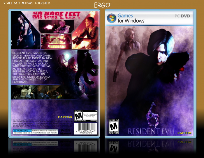
Reuploaded because I think it was ignored in the influx of boxes uploaded. (Read: Nobody saw it because five pretty good boxes were uploaded within one hour of its original post time).
For Midas Touch.
Credit to Deiviuxs for the Games for Windows template, Cerium for the Capcom logo, Ronthis for rendering some of the renders, Resident Evil wiki for the screens and artwork, Spiderpig24 for the logo, Titan38 for the ESRB ratings, and eximmice for the Leon render on the front.
Original: link (yes I realize that it looks almost nothing like the original).
 Resident Evil 6 Box Cover Comments
Comment on Ergo's Resident Evil 6 Box Art / Cover.

I wish I could remove a fav just for this: Reuploaded because I think it was ignored in the influx of boxes uploaded. (Read: Nobody saw it because five pretty good boxes were uploaded within one hour of its original post time).
[ Reply ]
Meh.
[ Reply ]
Sorry Ergo, but I can't say I like this one. First off, it resembles nothing of the original (which I know you previously admitted) and the back does not fit the style of a resident evil box at all. The front's logo is too low and the bottom of the back is too empty. The tagline should have been a color that doesn't clash with the purple-ish blue theme you have going there.
But hey, we all have our times.
[ Reply ]
BUT I'M PERFECT DAMN IT
[ Reply ]
Ye
[ Reply ]
It does have a lot of good in it, but it's kind of a miss in some areas. The first thing that got me when I saw it was the colour, I really like the colour scheme you got goin on. Though the characters lighting doesn't match the colour of the light itself. The back's layout is great, but maybe bare at the bottom.
That's all I've got to say about it really. It does look quite decent.
[ Reply ]
And yeah it doesn't look a whole lot like the original. But I'm beating a dead horse by saying that. :P
[ Reply ]