[ Box updated on November 9th, 2006 ] [ original ]
 Resident Evil 5 Collector's Edition Box Cover Comments
Comment on dark_raider's Resident Evil 5 Collector's Edition Box Art / Cover.
[ Box updated on November 9th, 2006 ] [ original ]
Comment on dark_raider's Resident Evil 5 Collector's Edition Box Art / Cover.
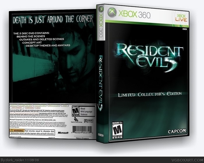
Here it is...My RE 5 collectors edition, this took me awhile...hope you enjoy it.
[ Reply ]
anyone...
[ Reply ]
frn looks cool but the back is kinda boring 4/5
[ Reply ]
its a collectors edition...what the flip.
[ Reply ]
#3 please dont rate my boxes until you know what u are talkin about...not tryin to be mean but Ive seen your boxes and most of them arent very appealing...sorry about double post.
[ Reply ]
#5, i know it's a collector's edition but i just think the text at the top is too stretched and the back isn't always so plain you know don't wanna be rude but it looks boring
[ Reply ]
o and sorry for the double post but i think it's boring because it's almost 100% black maybe put an more interesting pic on it but or the rest it's ok
[ Reply ]
there's pretty much no material for this game and I dont know how many Special editions you have seen but non in my knowledge are complex.
[ Reply ]
#8, you have a point there
[ Reply ]
yeah...
[ Reply ]
#6, yeah CE editions are mostly plain on the back
[ Reply ]
#11, or silver depens wich game it is
[ Reply ]
silver...black whats the difference
[ Reply ]
i got to say this one is good! 5/5
[ Reply ]
Thanx for the 5's...plz keep commenting
[ Reply ]
One thing: You spelled disc wrong. >:P
I'm such a spelling freak. 5/5
[ Reply ]
You took my place as number 1... :(
Oh well. That was the longest I've ever stayed as number 1. At least I'm still in the top ten.
Anyways, you really deserve to be #1, although the capcom logo doesnt quite fit in with the rest of the box. Try to make the white parts of it the same shade of green as the bottom of the box, and sort of blend it in. Still 5/5
[ Reply ]
I'm bored of Collector's Editions to be honest, them coming irregularly is fine but the plainess of these boxes gets old very fast when these type of boxes are coming so often and that is enougth to count as a criticism.
I also disliked the Resident Evil movies so I dislike your use of the movie font, when very little games use it and it's assossiated with those horrible films. I do love the colors and it's very nicely put together. 4/5.
[ Reply ]
I fixed the "disk" to "disc" and changed the capcom.
[ Reply ]
Deffo a 5, I'm loving the type technique. Got any good hints for a newbie like myself?
[ Reply ]
#20 you said a 5 but it doesnt show that u rated it.
[ Reply ]
whos been rating my box all low, this is getting ridiculous.
[ Reply ]
#22 DUDE, its 4.42 !! its a good score !! to put it bluntly this isnt the best fucking box in the world so 4.42 is a good score !! so deal with it
[ Reply ]
I know that but it would be nice to get comments, that is what makes a person improve the skills at something, in this case makeing box art. Im not pissed I just want some critiques.
[ Reply ]
doode, chill out. you already have 24 comments.
and your kinda being a hypocrite, you gave me a 2.5 and told me whats wrong but you didnt say what i could do to improve so and you think its ridiculous? well a whole bunch of us out there are feeling the same so you neeya stop. yeahhh....
i do like this box, and i undertsand why you chose it simplicity. but in the end it doesnt exactly catch my eye. also theres something wierd with the spine...
i dont want to add to this madness, so im just going to refuse to vote. i commented, i said what i wanted to say, good bye.
[ Reply ]
What do you mean Im being a hypocrite, I left you a comment...I never mentioned anything about having to tell me how to fix something...a simple explanation is fine with me and then I can find out how to improve it myself...it works better for me I would rather solve a problem than someone solve it for me.
And dont talk crap to me noob, Ive been here longer, I know what to do, and until you can make boxes better than me dont talk crap.
[ Reply ]
#26, to put it bluntly,
i think youre full of shit and i dont like you.
have fun making stupid collector's editions because thats all you can do.
[ Reply ]
#27, #26, you can almost feel the heat of the verbal flak being exchanged.
But anyway, great box, sweet font, 5/5 all around.
[ Reply ]
#26 Lol, actualy his boxes are much better than yours ;P
[ Reply ]
#27 I dont care like you either but theirs nothing I can do about, and besides I dont only make L.C.E. boxes.
#29 My earlier boxes did suck but I believe my most recent are more appealing than FinalFantaseer22.
[ Reply ]
Nice Job ,this should be
the box art of that game, if it comes out.
4.5/5
[ Reply ]
thanx.
[ Reply ]
#26, ok bouth of you now shut up ! before chaos happins her and it turns into spame .... anyways i like this box a lot 5/5 and also why don't you chaneg the ( the 2 discs contain ) into ( the bouns disc contat ) cause that's what it said in most L.C.E official boxs
[ Reply ]
#33, woah i kinda forgot about all this. i just got pissed at him for insulting my boxes.
but whatever, it should be past us.
[ Reply ]