Gah bugger, when I added the title on the side and fixxed up the spelling error it became bigger then 1 MB!!!! I don't really wanna make it smaller cause I just know I'll stuff it up so just imagine there's a title on the side and it says capped? ^.^
I don't like the background or the way the renders are blended in. I would suggest using a screenshot or drawn image for the backgound, instead of an abstract piece.
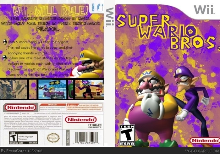
As previously said, there is nothing on the spine.
The screenshots on the back look ... funky. I don't know if it was intentional or not, but it looks like the second and fourth pictures were majorly cut off.
And lastly, I'm not a big fan of the Mario font on the back. It is a bit hard to read. If you're going to use the Mario font, I suggest you fill it with a color.
 Super Wario Bros. Box Cover Comments
I made the first SWBs on DS so I figure I should make the first on the Wii!, Please tell me this is much better then my Ratchet and Clank one XP
[ Reply ]
wow gd idea i say 5/5
[ Reply ]
There's nothing on the spine but everything else is great .
4/5
[ Reply ]
#3 Opps bugger! I completly forgot! but it's 2am here, so I'll do it tomorrow...
[ Reply ]
since when did mario have a red cape?
(look on back description)
nice box...............................................
[ Reply ]
#5, I believe he meant "red capped"
[ Reply ]
Gah bugger, when I added the title on the side and fixxed up the spelling error it became bigger then 1 MB!!!! I don't really wanna make it smaller cause I just know I'll stuff it up so just imagine there's a title on the side and it says capped? ^.^
[ Reply ]
weird but its got my vote
[ Reply ]
Interesting idea, but there are a few problems.
I don't like the background or the way the renders are blended in. I would suggest using a screenshot or drawn image for the backgound, instead of an abstract piece.
As previously said, there is nothing on the spine.
The screenshots on the back look ... funky. I don't know if it was intentional or not, but it looks like the second and fourth pictures were majorly cut off.
And lastly, I'm not a big fan of the Mario font on the back. It is a bit hard to read. If you're going to use the Mario font, I suggest you fill it with a color.
[ Reply ]
not that good but not that bad
[ Reply ]
Dont you think E10 would be a better rating.
[ Reply ]
#5, uhh he had a cape in Super Mario World (Altho it was not red It was yellow) (the game is on the snes)
[ Reply ]