@LastLight
No .... not bad at all
i feel If you change presentation The beauty of your cover It will be more shown
of course this presentation too is very nice
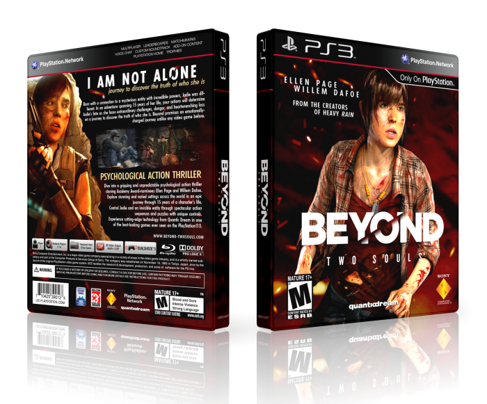
The presentation is a bit lacking, but the box is very well done. I like the fact you're bringing some of the elements of the logo to the header in the back.
Ellen on the front lacks a bit of contrast though. You can always go in and tweak it a bit, so there is a bit more shadows, since the background has great contrast and you want it to seem more integrated, rather than her floating on the background (I think at least).
This is one of your best so far. Overall a really refreshing design from you; I like that you change up your usual back structure. The box overall has a very dark feeling; which I really like.
Pretty well done.
 Beyond: Two Souls Box Cover Comments
Nice box but next time try to update the esrb ratings ok?
[ Reply ]
Very nice! I'm glad you trying a new style, colours and composition looks great, good work!
[ Reply ]
Many thanks mate. I'm glad You like it. I tried to change my style. I dont know acceptable or not. I hope it is better.
[ Reply ]
@LastLight Much better, Try to change your presentation...
8/10
[ Reply ]
Agree Zalay,Really Nice Box Lastlight . . .
[ Reply ]
Thanks for positive feedback.
[ Reply ]
@zalayetta Agree Zalayetta...Anyway box is great
[ Reply ]
But I love this presentation. Too bad?
[ Reply ]
@LastLight
No .... not bad at all
i feel If you change presentation The beauty of your cover It will be more shown
of course this presentation too is very nice
[ Reply ]
@LastLight I mean,Do something on whole structure, it's too blank and simple...
[ Reply ]
very nice my bro
[ Reply ]
Thanks arad.
[ Reply ]
The presentation is a bit lacking, but the box is very well done. I like the fact you're bringing some of the elements of the logo to the header in the back.
Ellen on the front lacks a bit of contrast though. You can always go in and tweak it a bit, so there is a bit more shadows, since the background has great contrast and you want it to seem more integrated, rather than her floating on the background (I think at least).
[ Reply ]
Thanks sis. Right, Thanks for your tips.
[ Reply ]
awesome / very very gooood
[ Reply ]
Thanks Milad.
[ Reply ]
The back is definitely a step in the right direction.
[ Reply ]
Appreciated a lot.
[ Reply ]
This is one of your best so far. Overall a really refreshing design from you; I like that you change up your usual back structure. The box overall has a very dark feeling; which I really like.
Pretty well done.
[ Reply ]
OMG, I'm very glad. Thanks bro.
[ Reply ]
@LastLight No prob, keep it up. Lots of really cool covers from you lately.
[ Reply ]
Great stuff.
[ Reply ]
Thanks SP, it means a lot.
[ Reply ]
how can i but it?
[ Reply ]
Well done
[ Reply ]
Thanks mate.
[ Reply ]
Congrats Payam ;)
[ Reply ]
wonderful
[ Reply ]
Congrats . . .
[ Reply ]
Thanks a lot, Guys.
[ Reply ]