I think this would do better as a mulitplayer map pack, since the SPARTAN on the cover is bright green..or blue...
As it stands, it's a great box that gets a 4.5/5 from me.
It's nice, it's real nice. But I really wouldnt expect there to be a multiplayer pic on the front of the box. If I was to do something like that, I would make it a Multiplayer Map Pac, or something like that.
4/5
Not because of a flaw, but because it doesnt seem to fit.
''Multiplayer map pack''...
Anyway, no just no... Yhis is good but not gaad as people are hyping this, of course this is opinoin think but i don't like this one that much. That red thing there dosent fit in this kinda blue style.
#20, Your spelling and grammar says alot about your intellegence. Half of what you said made no sense. You also might want to MAKE a box before you rate a box, that took ages, and a hell of alot of effort, low.

 Halo 3 Box Cover Comments
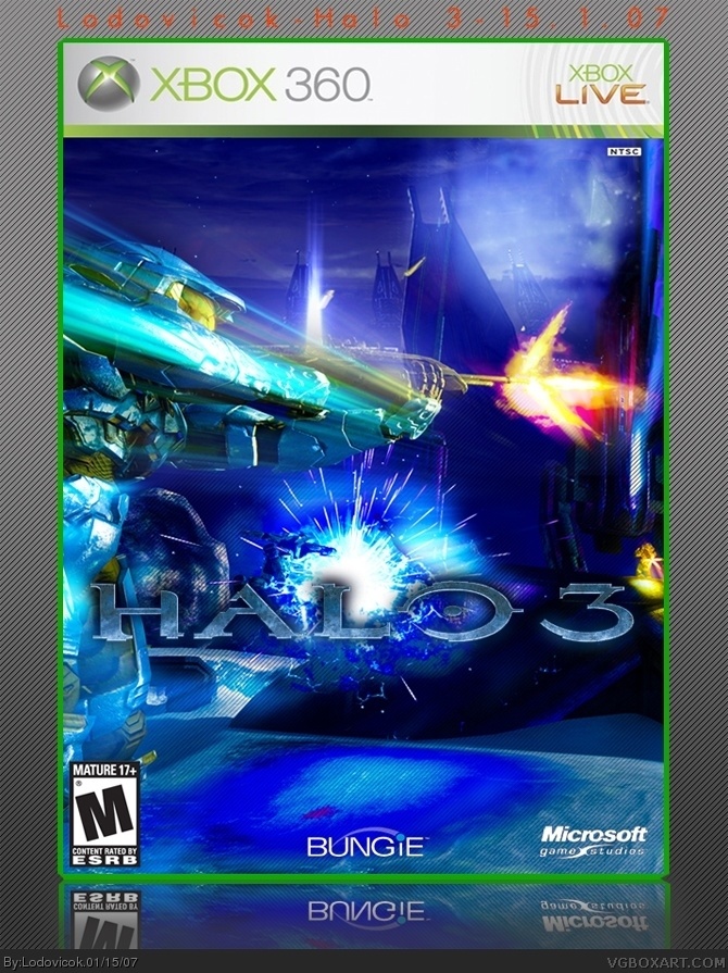
Please view in fullsize and keep in mind that the blur is due to jpeg compression.
I hope you like it, comments and votes would be appreciated ;)
-Lodovicok :)
[ Reply ]
Awesome box 5/5
[ Reply ]
Awesome add a back and it would be even better 4/5
[ Reply ]
Too flashy for a Halo box, but it's darn nice.
I don't dig the lines on the background, just not my personal preference.
4.5/5.
[ Reply ]
#3, why should i do that...i'm shit at backs and all it does is bring down my votes...
[ Reply ]
#4, i thought so too...but i tried to be a but different
[ Reply ]
*bit
[ Reply ]
I think this would do better as a mulitplayer map pack, since the SPARTAN on the cover is bright green..or blue...
As it stands, it's a great box that gets a 4.5/5 from me.
[ Reply ]
Don't forget to give Credit
to Crayon Man for his template .
[ Reply ]
#9, not my temp
[ Reply ]
This number 4 now !!!
[ Reply ]
#10, I thougth it was yours.
Sorry bout that .
[ Reply ]
It's nice, it's real nice. But I really wouldnt expect there to be a multiplayer pic on the front of the box. If I was to do something like that, I would make it a Multiplayer Map Pac, or something like that.
4/5
Not because of a flaw, but because it doesnt seem to fit.
[ Reply ]
holy shit that is good.
[ Reply ]
I spent ages getting the colour and contrast right on lightroom, but here it is:
Halo 3 Multiplayer Map Pack
as you wanted...
[ Reply ]
Logo seems a little slanted and the box seems a little too bright, I like it.
4/5
[ Reply ]
Personaly I Love It!
5/5
[ Reply ]
#17, thanks!
[ Reply ]
You changed it to a map pack. Good boy. I'll change my score.
[ Reply ]
''Multiplayer map pack''...
Anyway, no just no... Yhis is good but not gaad as people are hyping this, of course this is opinoin think but i don't like this one that much. That red thing there dosent fit in this kinda blue style.
3.5
[ Reply ]
Yay! Somebody listened to my advice!
I give it 5/5 now, good job.
(i'm a little late responding, but oh well...)
[ Reply ]
#20, Your spelling and grammar says alot about your intellegence. Half of what you said made no sense. You also might want to MAKE a box before you rate a box, that took ages, and a hell of alot of effort, low.
[ Reply ]