I also worked very hard on this box and it was originally huge but I had to resize it for submission. It kinda gets annoying without an edit feature. Sorry for the triple posts guys! :D
not tooo bad, evenb though its dq8 art
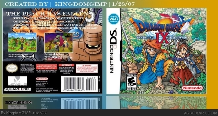
the log could use a white storke/shadow
level 5 logo on back should be cut out too, along with teh square one. font on back is meh--- boring and a little hard to read. add a stroke to that too.
No its not bad but use the squareenix logo with black back and white letters (i think theres one in box material but not sure), and when the back is so colorful it necessary to use small shadow or stroke on text or its impossible to read
 Dragon Quest IX: Protectors of the sky Box Cover Comments
I really am proud of this box I made! :D Credit to Crayon Man for the template! :D I just can't wait for this game to come out! :D
[ Reply ]
Oh yes and I liked the front without the Square Enix Logo.
[ Reply ]
I also worked very hard on this box too. It kinda gets annoying without the edit feature for comments.
[ Reply ]
I also worked very hard on this box and it was originally huge but I had to resize it for submission. It kinda gets annoying without an edit feature. Sorry for the triple posts guys! :D
[ Reply ]
Well the only thing I dont like is the text on the top back because it is hard to read w/ that thing behind it. So 4/5. The front looks cool!
[ Reply ]
and you do realise it's the 27th January today, right???
it's pretty cool but that text seems too stretched and squished. try making it smaller and add another sentence maybe.
But this is still pretty cool. I laugh at PS3 because this was going to be an exclusive for it.
[ Reply ]
not tooo bad, evenb though its dq8 art
the log could use a white storke/shadow
level 5 logo on back should be cut out too, along with teh square one. font on back is meh--- boring and a little hard to read. add a stroke to that too.
[ Reply ]
#6 Oh boy, wrong dates on my school stuff. Thank's for the notice! :D
[ Reply ]
one more thing--- reflection shoudl come al teh way up to the edge
[ Reply ]
#7 and #9, WTFs up with your grammar today?
[ Reply ]
Ok give me a few hours I have things to do! :D
[ Reply ]
#11, OK i'll wait!
*waits*
*waits*
are you done yet?!
[ Reply ]
#10, nothings wrong with my grammar, its my typing
[ Reply ]
#13, that's what i meant.
[ Reply ]
Well, do you guys think I have improved. I really want to know! :D
[ Reply ]
*?! :D
[ Reply ]
I love the colors of the box .
4.5/5
[ Reply ]
#1, That LupusDragon template.
[ Reply ]
#18, I did cut that uot from his last box, f that needs credit, I'M SORRY FOR NOT GIVING HIM ANY! :D
[ Reply ]
*out
[ Reply ]
arent you going to update it?
[ Reply ]
Sorry CS3 Beta Trial Time ran out. Two Days..jeez. Let me just transfer it to my CS2 Files! :D
[ Reply ]
Is it really that bad? 3.17?
[ Reply ]
No its not bad but use the squareenix logo with black back and white letters (i think theres one in box material but not sure), and when the back is so colorful it necessary to use small shadow or stroke on text or its impossible to read
[ Reply ]