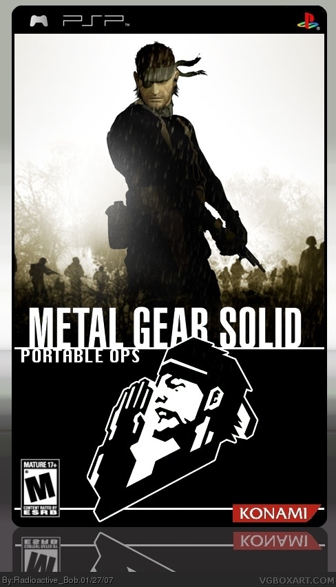
I've been working on this for a day, i'm bored again... :(
Also, i couldn't find a good logo for this, the ones I could find where wither too small, or bad quality. So I made my own logo. I'm pretty pleased with it. Anyways, I hope you like this. :)
(i vow not to make another box art for the next week...Really)
I love it because it reminds me of the Band of Brothers or Saving Private Ryan box, just like a movie but alas the reflection would be better more transparent and subtle.
4.5/5, excellent. Although the saluting soldier on the bottom seems to be....coming out of the box?! And it's a little too big. It would be nice if you could incourperate it with the logo horizontally some way, it looks a little smacked on. Still, very nice

 Metal Gear Solid: Portable Ops Box Cover Comments
I've been working on this for a day, i'm bored again... :(
Also, i couldn't find a good logo for this, the ones I could find where wither too small, or bad quality. So I made my own logo. I'm pretty pleased with it. Anyways, I hope you like this. :)
(i vow not to make another box art for the next week...Really)
[ Reply ]
i think it looks pretty good! i like the soldiers in the background. 4.5/5
[ Reply ]
Thanks Shady :)
But is there anything i could do to get a full 5?
[ Reply ]
looks good but the reflection is a tiny bit off, i though something looked ood so I looked at it in PS and saw that it was off.
[ Reply ]
you a re a very bored child aren't you?
[ Reply ]
*are
[ Reply ]
In a totally unrelated story, this is the first time in a while that the main page is full of good boxs, and not trolls! YAY1
[ Reply ]
Thanks for the comments everybody. :)
[ Reply ]
This box is sweet, but kinda looks like the saluting soldier part of the logo is off the box. But I know it isnt. Still 4.5/5
[ Reply ]
#9, yeah, i wanted it too look as if it was going off the bottom. But i'm glad you like it. :)
[ Reply ]
Well done.
[ Reply ]
this is awesome, as usual.
4.5/5
[ Reply ]
I love it because it reminds me of the Band of Brothers or Saving Private Ryan box, just like a movie but alas the reflection would be better more transparent and subtle.
[ Reply ]
Thanks guys. I can start working on an update soon. :)
[ Reply ]
Updated. Change reflection position , and lowered it's opacity. :)
[ Reply ]
oooo yummmy.
[ Reply ]
.............what?
[ Reply ]
Nice box , i think the logo should be centered .
[ Reply ]
Thanks Ratchet. :)
[ Reply ]
That boxart is way better than the real boxart....
8/5
[ Reply ]
Wow, that's a big number :P
Thanks.
[ Reply ]
4.5/5, excellent. Although the saluting soldier on the bottom seems to be....coming out of the box?! And it's a little too big. It would be nice if you could incourperate it with the logo horizontally some way, it looks a little smacked on. Still, very nice
[ Reply ]
#22, thanks. I probably should have swapped the background colors (the white and black) so that it didn't look like the soldier was going off the box.
[ Reply ]
i like this alot better than the real box art
[ Reply ]