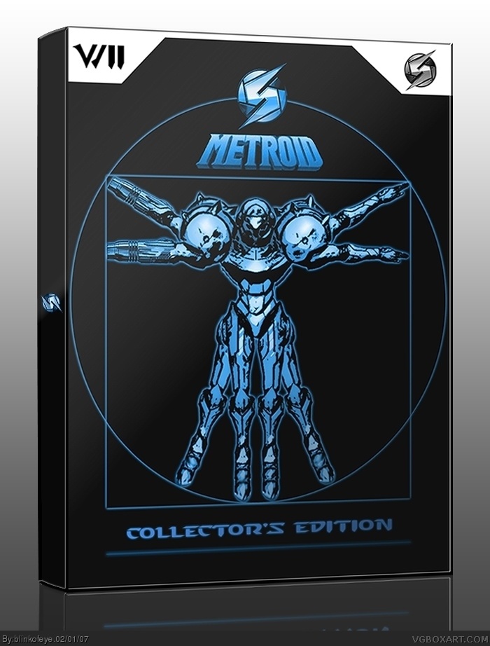
I imagine this collectors edition to be like a little anniversary collection for NA since first Metroid game came out 1987 in NA, and should include all Metroid games for home consoles
You now what, next time I'm just gonna find some wallpaper and put template and logos on it, those boxes always have high score here. Every time I try to make good looking and original box but someone give my boxes 4 before i even comment it. It happens every time except for killer instict
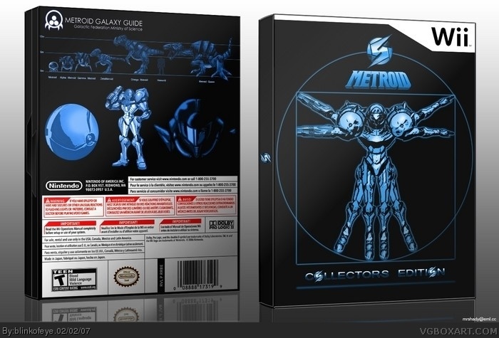
#8, #9 No its not bad but I draw the whole box myself and didnt just put the logos on wallpaper. And thecodemaster if you look at the box you will see that its a collectors edition thats why it doesent have standard wii template
I see, but you should use the official Wii font then. The Wii font is called "Continuum Bold".
Instead of that...well it looks like a starcraft font. But you did a very good job. If you change that Wii logo with the official font, then I'll give a 5/5. Until then...
#13, "If you change that Wii logo...I'll give a 5/5.", that sounds like a blackmail, just kidding, thank you for comment. I will change it if you think its better but i dont. Simply because wii logo is very soft and hole box is very sharp and clean like many collector editions boxes.
#12 - Special Collectors Edition? I didn't even know they do special cases for them! Well, I stand by what I said about using the official template because I didn't know this was a Wii game until I looked at the title, "Metroid (Wii)". Although, now I can see that the left top corner is "Wii", I didn't know that at first glance.
WOAH! You updated it just as I pressed "Submit Comments". Now it's better. I know that this is a Wii game - but I still want to see what it looks like with the official temp. :D:D:D
Here, if you don't know how collector's edition boxes look like please don't go with "there is no publisher, there is no rating..." all CE boxes are unique and very hard to find (usually 1000-10000 copies). There can be 10 CE boxes for wii and all totally different
#29, yes i did, and i was going to submit it in box materials, simple needs (without effects) but than i reallised that someone will stole it and claim that its there own art without giving credit. Like already happened on this site
#31, quit being a fucking dipshit and saying you are Napoleon Dynamite. This is stupid and unnessecary. I am a big fan of Jon Heder's comedic work (just saw Blades of Glory- awesome movie), and you, sir/maam/transvestite hooker, are not Jon Heder.
 Metroid Box Cover Comments
um good but it looks so weird.
[ Reply ]
I imagine this collectors edition to be like a little anniversary collection for NA since first Metroid game came out 1987 in NA, and should include all Metroid games for home consoles
[ Reply ]
#1, well I was inspired by Leonardo da Vinci's "Vitruvian Man"
[ Reply ]
It is definitely different.
[ Reply ]
Nice. I like it. Very original. I could see them actually making this...
[ Reply ]
You now what, next time I'm just gonna find some wallpaper and put template and logos on it, those boxes always have high score here. Every time I try to make good looking and original box but someone give my boxes 4 before i even comment it. It happens every time except for killer instict
[ Reply ]
The box is really likeable.
Nice one blinky, think of a better nickname if you want.
[ Reply ]
A 4 isn't bad.
[ Reply ]
What? A 4 is awesomeness. I gave this a 4 too! I feel that you need to use an official Wii template.
[ Reply ]
i like this one a lot, i'm not saying it's bad at all, i'm saying it looks kinda strange, but you explained that. so 4.5/5.
[ Reply ]
i think the official template wouldve made it look better
[ Reply ]
#8, #9 No its not bad but I draw the whole box myself and didnt just put the logos on wallpaper. And thecodemaster if you look at the box you will see that its a collectors edition thats why it doesent have standard wii template
[ Reply ]
I see, but you should use the official Wii font then. The Wii font is called "Continuum Bold".
Instead of that...well it looks like a starcraft font. But you did a very good job. If you change that Wii logo with the official font, then I'll give a 5/5. Until then...
[ Reply ]
#13, "If you change that Wii logo...I'll give a 5/5.", that sounds like a blackmail, just kidding, thank you for comment. I will change it if you think its better but i dont. Simply because wii logo is very soft and hole box is very sharp and clean like many collector editions boxes.
[ Reply ]
I love the design of this, very unique.
4.5/5
[ Reply ]
Work on the font for "Wii" and possible "Collector's Edition" and I'd rank a five. For now, it gets a 5.4/5
[ Reply ]
*4/5
[ Reply ]
#12 - Special Collectors Edition? I didn't even know they do special cases for them! Well, I stand by what I said about using the official template because I didn't know this was a Wii game until I looked at the title, "Metroid (Wii)". Although, now I can see that the left top corner is "Wii", I didn't know that at first glance.
[ Reply ]
WOAH! You updated it just as I pressed "Submit Comments". Now it's better. I know that this is a Wii game - but I still want to see what it looks like with the official temp. :D:D:D
[ Reply ]
I like this a lot .
[ Reply ]
Here, if you don't know how collector's edition boxes look like please don't go with "there is no publisher, there is no rating..." all CE boxes are unique and very hard to find (usually 1000-10000 copies). There can be 10 CE boxes for wii and all totally different
[ Reply ]
#19, OK thanks
[ Reply ]
I just updated box, added the back cover and made template look more like official wii but with sharp edges
[ Reply ]
It looks sweet, but personally I think it would look better w/ the offficial temp but still good.
[ Reply ]
#24, believe me it doesn't it ruins the sharp look of box and this is collectors edition for the 364823 time.
[ Reply ]
#25, I know but still im just stating my opinion.
[ Reply ]
This box is friggin' awesome....I love this thing. The back is great as well. I love the enemy guide...perfect. Now all it needs is a release date...
[ Reply ]
absolutely great 5/5
[ Reply ]
Did you make that pic on the front yourself?
[ Reply ]
#29, yes i did, and i was going to submit it in box materials, simple needs (without effects) but than i reallised that someone will stole it and claim that its there own art without giving credit. Like already happened on this site
[ Reply ]
DaVinchi...he is so GOSH!
[ Reply ]
This looks really cool, but it has more of a tin feel to it rather than a box art only because it has a metallic look to it.
[ Reply ]
This is pwnage. 5/5 easily.
#31, quit being a fucking dipshit and saying you are Napoleon Dynamite. This is stupid and unnessecary. I am a big fan of Jon Heder's comedic work (just saw Blades of Glory- awesome movie), and you, sir/maam/transvestite hooker, are not Jon Heder.
[ Reply ]
Pokemon vs. Gayboy...Who will win?
[ Reply ]