![]() »
»
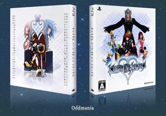
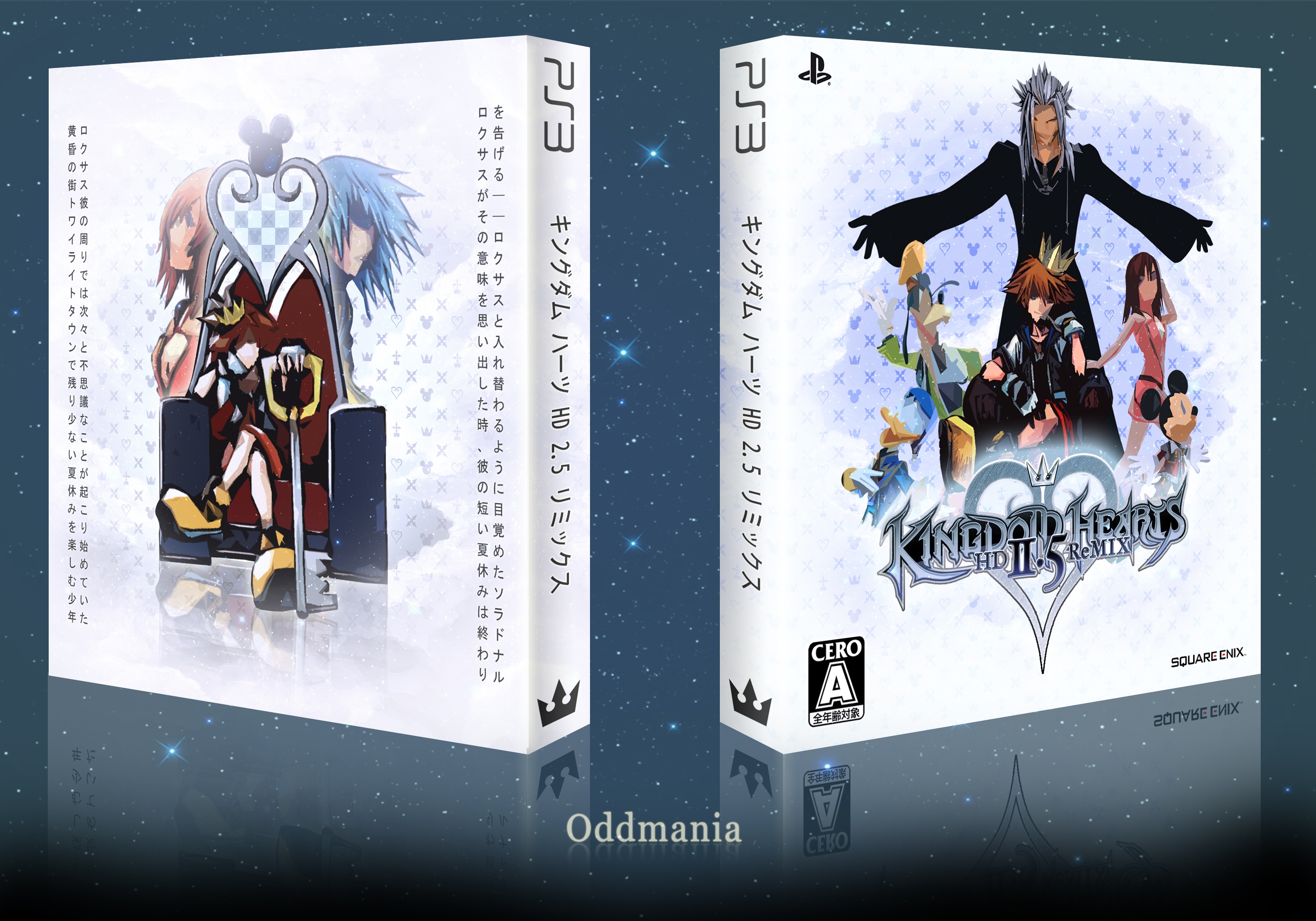
This one was so much fun to make. I saw the game's brand new Jump Festa trailer and I thought it deserved a cover.
[ Box updated on December 30th, 2013 ] [ original ]
 Kingdom Hearts HD 2.5 ReMIX Box Cover Comments
Comment on Oddmania's Kingdom Hearts HD 2.5 ReMIX Box Art / Cover.
Very Nice ;)
[ Reply ]
Looks Great,I Really Like It,I'm Really Happy See You're New Cover After A Long Time . . .
[ Reply ]
@matingsm
na baba...!
hey Oddmania, this is it, perfect.
[ Reply ]
Thanks, guys. Thank you Mathingsm, I don't get around to posting covers very much, but I'm always around :)
[ Reply ]
@Oddmania Thank You Too,Good Luck Bro . . .
[ Reply ]
The design itself is really good but the cutout filter is way too heavy. I understand why it was necessary, but it is pretty jarring.
[ Reply ]
Thank you. Yes, I see what you mean. I'm really happy with how it came out, though. When I started the box, I was all over the place, looking for the perfect design that would make the cover as genuine as possible. Every Kingdom Hearts cover is a hell of a job to make, because the official boxes are always made up of a single piece of artwork, so you can't just slap a couple of renders into a template and make it feel real. I've tried to make something reminiscent of cubism, surrealism and expressionism. That's why the characters appear so blocky, with rough faces, almost like ghosts. I really wanted it to be as surreal as possible. It wouldn't have felt the same if I'd used the filter half as much.
[ Reply ]
I agree with AgentLampshade completely. The filter is by far the worst part about this box. I don't think that the filter carries over through all artwork consistently with CG artwork being affected differently than the drawn artwork. Really, if you had just made it vector with simple shading inside then it would have been bounds better. The PS3 logo is stretched way too much on the spine.
It has so much potential. We can all see it in things like the text on the back and the very cool background, but that cutout filter holds it back more than anything else.
[ Reply ]
Well, I'll have to consider using vectors next time then. But the point really wasn't to make CG renders look like drawn artwork. I wanted to add a surreal feel to it, with blocky shapes and distorted faces. Geez, you're definitely right about that PS3 logo! I've got to fix that.
[ Reply ]
I agree with the two above me. It's more so though, when seeing it at fullview as the problem. I can see why you did it, but I feel like it could have been cleaned up a bit. The box itself overall though, is really nicely put together.
[ Reply ]
well done.
[ Reply ]
Thanks everyone. I've edited the spine and fixed the reflection :)
[ Reply ]
Congrats ;)
[ Reply ]
Congrats Bro,Well Deserved . . .
[ Reply ]
Congrats :))
[ Reply ]
Love it. Looks really nice.
[ Reply ]
Geez, thank you so much guys! :)
[ Reply ]
congrats
[ Reply ]