![]() »
»
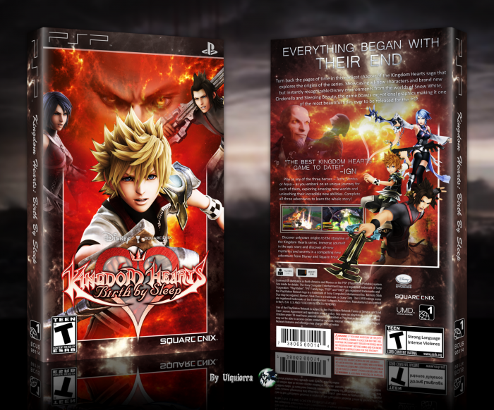
I wanted to do a BBS box without blue and white color theme. Wait for coms and criticisms.
And here's my last collab with Yumi >> link
[ Box updated on January 25th, 2014 ] [ original ]
 Kingdom Hearts Birth By Sleep Box Cover Comments
Comment on Ulquiorra's Kingdom Hearts Birth By Sleep Box Art / Cover.
very nice man ;)
[ Reply ]
Thanks! :D
[ Reply ]
That's nice ,:")
[ Reply ]
Thanks! :D
[ Reply ]
This is really nice. Especially love the way the front is and the way the concent is broken down, but there are some minor things I feel like that should be fixed. Like, some of the renders aren't that great in quality when you examine it at full-size, such as Aqua on the front. I can tell you scaled them up somewhat, instead of finding something larger to work off of. I understand wanting to use those images, but it may have done better for you to scale down the box a wee-bit.
When it comes to the back, I like the image you used of the three of them together and the way Terra's keyblade breaks out of the frame, but I'm confused as to why you chose to do a right angle frame. I think it would have been better to have framed out the content below the first paragraph and shift over the text more inward, since the spacing around the edges are kind of all over (what I mean is, the bottom legal facts are more in, while the above content is out more—I'd align them a bit better and you really don't need that indent before "Play as any…"). And the text gets a little illegible on the white clouds at the top, even with that drop shadow on the text. I'd tweak those clouds down a bit.
I'll apologize if it seems I'm nitpicking way too much, it's just due to the fact that you always do a very good job with your boxes and I feel as if you have the capability to take them to the next level, thus why I'm even critiquing in such detail.
[ Reply ]
Thanks, I'm really gladd to have your opinion on this, I'm working on an update.
[ Reply ]
@Ulquiorra This looks so, so much better now.
[ Reply ]
coooooooooool
[ Reply ]
Thaaaaaaaaaaanks!
[ Reply ]
very good
[ Reply ]
Thanks!
[ Reply ]
Looks nice box,front awesome and back really nice,but I think there's a free space between 2 renders on back , perhaps its not my favorite ... but that's not bad .. totaly I like this cover,and I hope you don'y get the wrong meaning about renders on back from my comment Bro . . .
[ Reply ]
Thanks! Does it looks better now?
[ Reply ]
@Ulquiorra It's good to see you didn't get me wrong . with these changes , there's nothing to say . it's grerat ,thanks dude . . .
[ Reply ]
Forgot to say: "updated!"
[ Reply ]
I'm not particularly fond of the imbalance between Aqua and Terra on the front, and I think the front's logo could either be contrasted more or recolored, but I like the back. The frames could be a little more opaque in my opinion.
Good box overall though, looks real cool.
[ Reply ]
Thanks, I'll change the logo.
[ Reply ]
Logo updated!
[ Reply ]
very good
[ Reply ]
Thanks!
[ Reply ]
This looks phenomenal.
[ Reply ]
Thanks!
[ Reply ]
Realy nice.
[ Reply ]
Thanks!
[ Reply ]
It's a bit weird that Ventus hogs so much of the front, still very fun to look at.
[ Reply ]
Because it's my favorite KH characters, it's the advantage of doing our own boxes X)
Thanks.
[ Reply ]
Congrats ;)
[ Reply ]
Thanks! :D
[ Reply ]
You out of all people deserve HOF the most. Congrats man.
[ Reply ]
Thanks a lot dude! :D
[ Reply ]
Congrats,Well Deserved . . .
[ Reply ]
Thanks! :D
[ Reply ]
Thanks a lot for this HOF guys! :D
-when I think that I wasn't sure to finish it...
[ Reply ]
Congrats
[ Reply ]
@iman pro thaaaanks! :D
[ Reply ]
The only thing I don't like is the choice of placing the front cover on the left side of the back cover, instead of the usual front cover being at the right of the back cover but WHATEVER THIS IS GOLD! THIS IS DELICIOUS!!!
[ Reply ]
X) Thanks a lot for the kind words man!
[ Reply ]