
[ Box updated on February 25th, 2007 ] [ original ]
 Digimon Digital Monsters RPG Season I Box Cover Comments
Comment on digital6m's Digimon Digital Monsters RPG Season I Box Art / Cover.
[ Box updated on February 25th, 2007 ] [ original ]
Comment on digital6m's Digimon Digital Monsters RPG Season I Box Art / Cover.
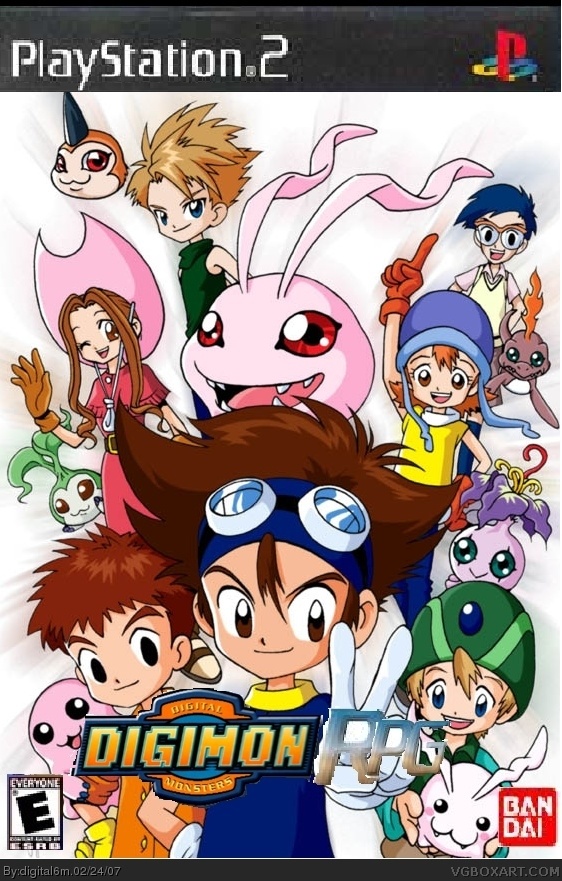
this is for all people that like season 1
[ Reply ]
i havent seeen this show since i was like 6 ! it looks pretty cool the "rpg" part of the logo is kinda smugy and can't you put something in the bg? its kinda plain. 2.5 for it
[ Reply ]
oh one more thing fix the playstation logo dude
[ Reply ]
who friggen watches this crap anymore??? I watched a lot of this when I was a wee little man (looking at me now you'd be amazed I was once actually little) i followed the show it was cool and all back then, but now!?!?!?!?! seriously get your head out of 1998 and get to the friggen future where there's gory violent fun. NOT ugly little pink blobs on top of (crazy haired) peoples heads.
the box..... well it stinks 1/5
[ Reply ]
#4, wow. i would really like to know what part of this box stinks other than the template and maybe the letters "RPG." This box most definately does not deserve a one. Its easily atleast a 3 out of 5 . Just fix the template and add maybe a drop shadow to the "RPG" part.
[ Reply ]
im going to send one more digimon box then something else
[ Reply ]
please stop...
[ Reply ]
#5, there is no background, the RPG logo and digimon logo is blurry, the bandai logo is blurry, the esrb logo is blurry, the teplate is blurry. Also many things were cut out badly. This clearly does deserve a 1 for lack of effort.
[ Reply ]
template*^
[ Reply ]
the box sucks even more than the show. that must be bad.
[ Reply ]
People still like Digimon ?
[ Reply ]
#11 no, digimon has rotten in hell.
[ Reply ]