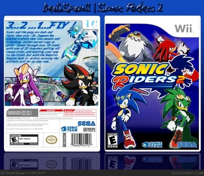
I've been working on this since last night and its finally finished. if you see any flaws I'll prolly fix them through a link because this box has a good 45 layers to it . cred to crayon man for the temp, Sockeymeow for the logo, CaptRicoSakara from Deviant Art for Rico (the blue guy on the back), and a special thx to Koopa for helping me find some of the characters.
i agree with #3, but also i think the front background is a bit too plain (you can maybe use a semitransparent layer over the color of one of these link --- just an idea)
also the two characters on the back are covering up the screens too much so that you really only see one screenshot.
Yeah, the back text needs some work, like Koopa said. And having 3 screens, but only being able to see one doesn't look to great, as FF22 said.
But an overall nice box.
thx for the comments people. I think I'll put the purple bird thingy and Shadow behind the screens and I'll try to fix the font and grammar of the text later. as for the front I'm keeping it the same
 Sonic Riders 2 Box Cover Comments
I've been working on this since last night and its finally finished. if you see any flaws I'll prolly fix them through a link because this box has a good 45 layers to it . cred to crayon man for the temp, Sockeymeow for the logo, CaptRicoSakara from Deviant Art for Rico (the blue guy on the back), and a special thx to Koopa for helping me find some of the characters.
plz rat.... I mean just comment :p
[ Reply ]
holy shit. this is amazing its everything a sonic box should be. great job with this one deathspawn...great job
[ Reply ]
Back text needs work....other than that, it looks cool. 8.5/10
[ Reply ]
i agree with #3, but also i think the front background is a bit too plain (you can maybe use a semitransparent layer over the color of one of these link --- just an idea)
also the two characters on the back are covering up the screens too much so that you really only see one screenshot.
[ Reply ]
im going to partially take back what i said, because it is much nicer in full view
[ Reply ]
awsome
[ Reply ]
Yeah, the back text needs some work, like Koopa said. And having 3 screens, but only being able to see one doesn't look to great, as FF22 said.
But an overall nice box.
[ Reply ]
thx for the comments people. I think I'll put the purple bird thingy and Shadow behind the screens and I'll try to fix the font and grammar of the text later. as for the front I'm keeping it the same
[ Reply ]
This box is awsome! By the way did you get that shadow from deviant art or something?
[ Reply ]
no I got the blue guy from DA, Shadow I got off google.
[ Reply ]
As I said in forums and IM great box 10/10
[ Reply ]
this is fricken sweet! but that shadow art is UNNOFICIAL! get the official one.
[ Reply ]
#10,who's the blue guy?
[ Reply ]
One of my favorites!
[ Reply ]