![]() »
»
The Good Night 2014 Competition
In Memory of My Friend Payam Mazkori (LastLight) :x
Logo : link
Render : link - link - link
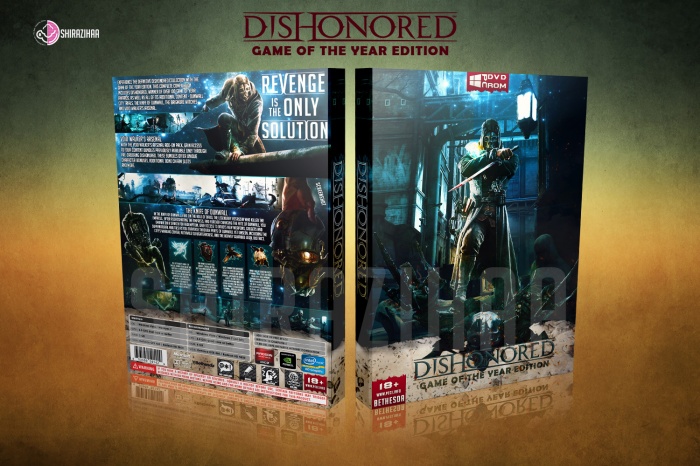
 Dishonored: Game Of The Year Edition Box Cover Comments
Comment on shirazihaa's Dishonored: Game Of The Year Edition Box Art / Cover.
So this is your second entry?
[ Reply ]
Yeah ;)
[ Reply ]
@shirazihaa It's great. I love how you incorporated the dark/night theme - I love it! Also, can you message me a high-res version again :) ?
[ Reply ]
@aldimon ok jakob ;)
[ Reply ]
I love it man, very nice job. Both sides work perfectly together.
[ Reply ]
Thanks Vincent ;)
[ Reply ]
Amazing.
Not too crazy about the template tough..
[ Reply ]
Yeah , Crazy Is Thief . Thanks My Brother ;)
[ Reply ]
Good job. Like the layout on the back, but ease up on the capitalization of everything.
[ Reply ]
Thanks Lucid ;)
[ Reply ]
I Think Back Are Very Nice , Front Pretty ;)
[ Reply ]
Thanks Man ;)
[ Reply ]
Amazing Job Bus . . .
[ Reply ]
OH , Thanks Taxi (ghommm ghommmmm ;)
[ Reply ]
printable : link
[ Reply ]
I really like it. I have to agree with deiviuxs, though, your old template looked much better.
Still, the composition on the front and back (except for the white part on the front that looks a bit odd) is masterfully done.
Great job, and best of lucks in the competition. :)
[ Reply ]
Thanks My Friend ;)
[ Reply ]
I have nothing to add to the rest of the comments -- this looks great.
[ Reply ]
Thanks Ayron ;)
[ Reply ]
Congrats dude!!
[ Reply ]
Thanks My Friend ;)
[ Reply ]
Congrats Bus,Well Deserved And I Think Best Competition So Far . . .
[ Reply ]
Thanks Taxi :D
[ Reply ]
Another congratulations to you, amazing cover
[ Reply ]
Thanks Vincent ;)
[ Reply ]
Two in a row! Nice! Congrats, man. ;) Wish you best luck in the competition.
[ Reply ]
Thanks Jakob ;)
[ Reply ]
Fantastic WORK, i love the back idea...
[ Reply ]
.hard work don't make replay
[ Reply ]
Upset and worst.hard work man
[ Reply ]
u????????
[ Reply ]
I'm a sucker for the blue color tone boxes. This is great. Arrangement is great as well. My only nitpick is the amount of info on the back. Just a bit too many words.
[ Reply ]
While this is a great box, i dont think it really hits home. There is way too much going on with the text on the back and i dont know what to focus on. It is good work though!
[ Reply ]
Amazingly done!!
[ Reply ]