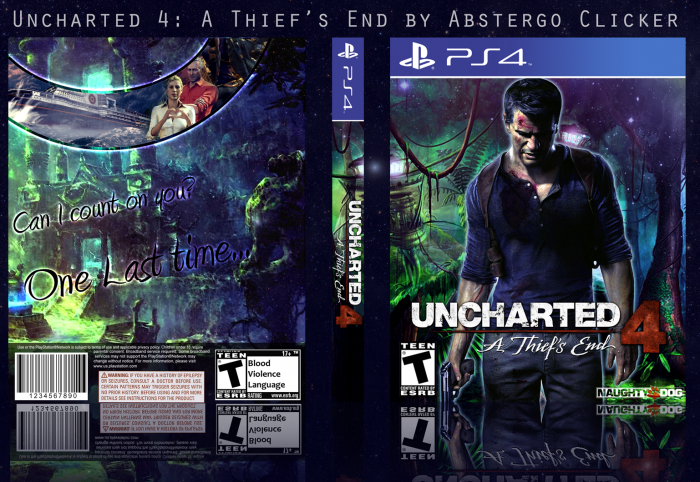
For some unexplained reason every time I try to upload this cover the colors are washed out, even when I lower the resolution. Here link is a better representation of the cover, and what I ask that you view when considering this box art (and it's also the best way to view it in general).
[ Box updated on November 2nd, 2014 ] [ original ]
 Uncharted 4: A Thief's End Box Cover Comments
Comment on abstergoclicker's Uncharted 4: A Thief's End Box Art / Cover.
So, making this was a ton of fun, I played around with a bunch of different color schemes but settled on this, as I think it fits nicely. I went through a million different ideas for the back, but without any information or gameplay, nothing really looked as nice as this simplistic back, and I feel like it not only fits the tone of the competition, but also the cover and the game (from what we know) very well. Hope you like looking at this as much as I liked making it.
[ Reply ]
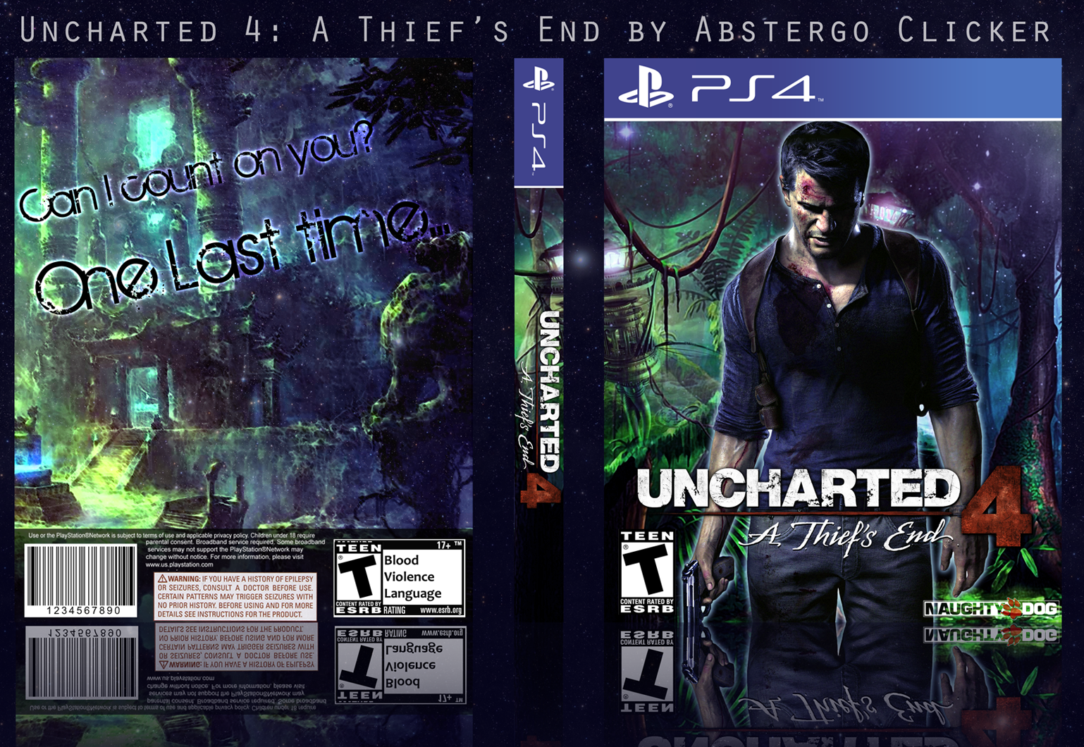
Thank you to everyone who gave me some feedback. I took a while, slept on it and added a few things to the back. Not much, but hopefully it looks a little bit more finished and whole, now. I also changed the font because I agree that it didn't fit as well as I'd have liked.
[ Reply ]
not good , not feet render
[ Reply ]
Nice, the front is better, I know there is minimal resources for this but overall not bad. And got to love uncharted
[ Reply ]
Thanks!
[ Reply ]
@abstergoclicker love the update
[ Reply ]
While those are some damn great colors for sure, and I love the feeling of the box. It has such a great potential, but feels really unfinished, and the font on the back doesn't fit the theme.
[ Reply ]
Thank you. I know what you mean. In a way, it is kind of unfinished, because I plan on adding to it when there's more information released on the game, but this is still a box on it's own (and the version I'll use when I print it out and replace the actual cover of the game xD), so I'm going to update with a few changes I made.
[ Reply ]
@abstergoclicker Great update.
[ Reply ]
@aldimon Thanks.
[ Reply ]
This update actually makes the back much better.
It reminds me a lot of Moogle's boxes, as in the sense of having really nice colors and a bit unfinished but still interesting backs.
Overall, cool job. Keep at it. :)
[ Reply ]
It's so awesome that you know moodle.
[ Reply ]
@aldimon That rings a bell.
[ Reply ]
@FrankBedbroken Thanks. Moogle's boxes were really nice so I'm pretty happy with that comparison.
[ Reply ]
Wish you best luck in the competition, by the way.
[ Reply ]
Thank you! I'm going to need it with the quality of who and what I'm up against.
[ Reply ]