Template By LastLight
GoodNight2014
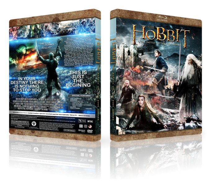
 The Hobbit: The Battle of The Five Armies Box Cover Comments
Comment on S.H.I.E.L.D.'s The Hobbit: The Battle of The Five Armies Box Art / Cover.
Template By LastLight
GoodNight2014
Comment on S.H.I.E.L.D.'s The Hobbit: The Battle of The Five Armies Box Art / Cover.
Holy shit, this is outstanding! Those are some DAMN great colors, and the whole composition is beautiful!
[ Reply ]
Also, noticed a little typo. It's 'beginning', not 'begining'.
[ Reply ]
@aldimon oh thanks aldi , soon update
[ Reply ]
Dreamy & Amazing My Friend ;)
[ Reply ]
Amazing man. This is beautiful
[ Reply ]
Fantastic Job,And Really Wonderful Colors . . .
[ Reply ]
Back composition is just plain odd. And the spine looks like it was just pasted there. I also do not understand why you use those top/bottom borders, they look grainy and they do not go with half the box arts you use them on. It's hard to determine a focal point for the front; there are literally characters placed in the oddest of places which makes one who is looking at it to be very confused at what to look at.
[ Reply ]
I agree with Martiniii332.
I understand you're aiming for something different, but the execution isn't quite up to par. Your composition on the front does not flow and I find the scale you chose to do most of the characters odd. Why is Bilbo large than the other two on the bottom left? He's a hobbit AND in the background, which would immediately make him smaller or at least the others larger. It just doesn't make sense with the perspective.
The back font choice does not go with the series. You are constantly using the same font and the same brown template. I understand the brown template, because it may be your signature trait, but the font in this case makes no sense. A serif font would have been much more appropriate for the box, as opposed to the sans-serif you used, due to a serif font being a little more classical and appropriate to the setting of the Hobbit.
On top of it all, that summary is a wall of text. You do not want that. It's not even much of a summary, but more so sound like a scene. I'd replace it with an actual summary and something about half the length. You also do not need to center-align the paragraph—it takes away.
I do have to add that the screencaps on the back look great as does your placement of images and text, but font selection and alignment issues with the text is what makes the back a dealbreaker for me.
[ Reply ]
Love it!
[ Reply ]
I don't understand why there are so many lens flares on the back - does not fit to this movie at all.
[ Reply ]
Very Pretty.
[ Reply ]
this guy and his blue lens flares lol
[ Reply ]
tnx all friend
[ Reply ]
Now you can not download .
[ Reply ]