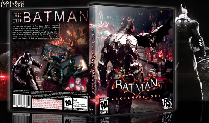
My second submission for the competition and what I consider one of my best boxes (though I really liked my TLOU one at the time so I can't be trusted with that xD), it's for a game I'm definitely looking forward to. It's also the first one I made without a template so if you would like a printable just comment about which system you'd like it for or add one to the printable provided. I hope you like it!
Render credits to Shirazihaa and Ulquiorra
EDIT: the printable looked awful when I checked it so here's this.... link
UPDATE: Something odd happened with the proportions but they look correct now.
[ Box updated on November 5th, 2014 ] [ original ]
 Batman: Arkham Knight Box Cover Comments
Comment on abstergoclicker's Batman: Arkham Knight Box Art / Cover.
Love the composition and colors from the front, but I'm not a fan of that back though.
[ Reply ]
Thanks. That's an area I've been really working on trying to improve.
[ Reply ]
front : very good
back : need a little work
[ Reply ]
I really like the composition of the front and the back. You should make the text on the back block-bound, otherwise I really like this.
[ Reply ]
Oh, and get rid of the second batman on the front.
[ Reply ]
Thanks! and thank you for the tip about the text! I knew something was kind of odd about it.
When you say the second batman, do you mean because he's on the back? The guy on the left on the front is Arkham Knight, the main antagonist in the game,
[ Reply ]
@abstergoclicker
Oh, I didn't know that! Still, the Batman render on the front with the wings out looks a bit displaced, I'd get rid of him, the front looks fine without him and has a very strong look.
[ Reply ]
Very cool man, I really like this
[ Reply ]
Thanks, man. I appreciate it.
[ Reply ]
Looks much better now with the block-bound text! Kudos
[ Reply ]
I agree
[ Reply ]
Thanks to you for your suggestion~
[ Reply ]
I don't think the screenshots on the back work. They look kind of forced.
[ Reply ]
I'll keep that in mind for next time. Thank you.
[ Reply ]
I love it all, except from the two batmans on the front. It really kills it for me, but I don't really know why it's such a big deal.
[ Reply ]
It's not 2 batmans. One in the foreground is the arkham knight who is the new main enemy in the game
[ Reply ]
@Vince_1990 Oh, alright. I've kept out of all Arkham Night talk to avoid spoilers, so I just figured it was another suit for the Batman. In that case, it all makes much more sense.
[ Reply ]
@oxol I thought the same as you when I first saw it
[ Reply ]
Looks amazing.
[ Reply ]
Cover Is Very Good Specially The Front, But I Think You Can Work More On The Back, For Example The Render You Used On The Back Left Is Not Connected To The Other Parts, And The Place Is Not Good, And You Can Use Better Render And The Background You Use Can be Also Better, At Last It's Not That Bad But It's Not My Favorite, You Have To Try More . . .
[ Reply ]
Veeeeeery nice beeeeuti
[ Reply ]
Front looks ace. The screenshots on the back could have been done better, but other than that, good job all round.
[ Reply ]
I love this. And since there's no Console Logo, I can print this for my Xbox version. Thanks.
[ Reply ]