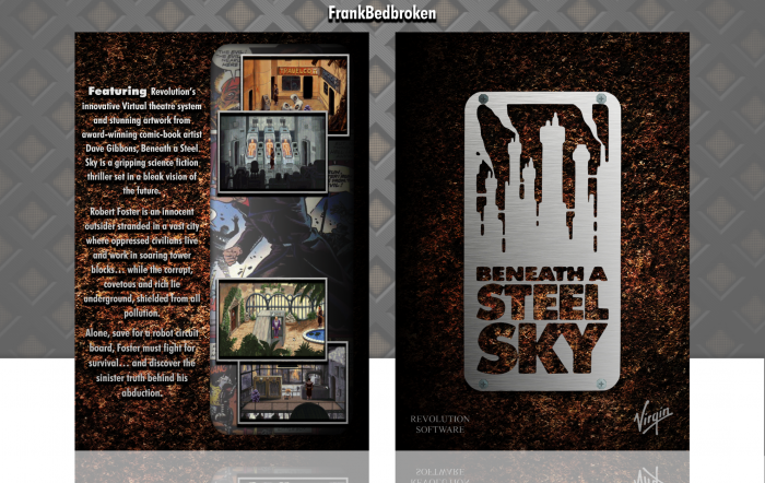
New box! :)
I didn't have that much ideas for new stuff. So, I decided to go the lazy way, and make a shoddy remake of a box of some sorts. And, because I recently got BASS cause I joined GoG, I decided to go for something to it.
As always, constructive criticism is welcome, and thanks to aldimon, lucidhalos, Huegh and TheTombRaider for the help and the feedback on the forums. It's really appreciated. :)
Hope you like it. ;)
 Beneath a Steel Sky Box Cover Comments
Comment on FrankBedbroken's Beneath a Steel Sky Box Art / Cover.

I really like the style of this. It reminds me a bit of your Fallout Cover. This looks very retro and very nice.
[ Reply ]
Thanks, Jakob! Question: do you think this is fitting for the Good Night competition?
[ Reply ]
@FrankBedbroken not really, sorry :/
[ Reply ]
@aldimon Oh, ok then. :)
[ Reply ]
Very nice :)
[ Reply ]
Thanks, Nathan! :D
[ Reply ]
I Agree With Aldi For Style And Really like Idea,Nice Job Man . . .
[ Reply ]
Thanks, Matin! Really appreciate it! :)
[ Reply ]
Agree Matin , Good Work ;)
[ Reply ]
@shirazihaa Thanks, Amin! Means a lot coming from you! ;)
[ Reply ]
@FrankBedbroken ØŒThanks , Soon ;)
[ Reply ]
Nice creativity on the style ;)
[ Reply ]
Thanks, Andre! :D
[ Reply ]
Nice Dude... ^^
[ Reply ]
Thanks, JR! :D
[ Reply ]
Gotta say, this is a pretty good box! ...but it's definitely not up to your usual standards. The background for the screenshots looks a bit out of place and the font could be more fitting. You did do a good job with it overall though. Can't wait to see your next one. :)
[ Reply ]
Yeah, I would say this is one of my laziest boxes, as in the sense that I didn't really put much work into it. Although, I'm not really sure why people talk about my "standards" when my boxes are mostly meh at best. About the background for the screenshots, it's a comic that came with the game in it's diskette edition, but I could've found a better way to implement it. As for the font, I don't know which one should I use that's legible and fitting at the same time. Thanks for the feedback, pal! :)
[ Reply ]
@FrankBedbroken Well a good box is one that people enjoy looking at and woujld pick over the official ones. I'd say all of yours are like that for me, so that's where your standards come from! :) And yea, fonts are tricky because they're legible to some people but not to others. Anyway, you did do a good job with it overall~
[ Reply ]
Love the front cover man. Well done!
[ Reply ]
Thanks, Vince! :)
[ Reply ]
This came out nice. I still think the back picture seems out of place, but other than that this is good.
[ Reply ]
Thanks, lucid! :D I really didn't know what to put in there, so I just slapped that in there and called it done. Any suggestions?
[ Reply ]
I Think This Is Pretty Cover :)
[ Reply ]
Thanks, Iman. :)
[ Reply ]