I don't think that 'OFWGKTA' in the bottom right of the back is necessary. It clashes with the rest of the box, it looks too vibrant and sticks out like a sore thumb.
Aside from that, I think the rest of the back is nice, and I really like the front.
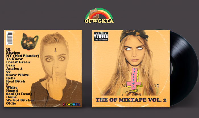
 The OF Mixtape Vol. 2 Cover Comments
I don't think that 'OFWGKTA' in the bottom right of the back is necessary. It clashes with the rest of the box, it looks too vibrant and sticks out like a sore thumb.
Aside from that, I think the rest of the back is nice, and I really like the front.
[ Reply ]
I'm seemingly creeped out by this, but yet, I kinda like it.
[ Reply ]
This looks as good as weird.
[ Reply ]
I like some of this but not other parts. I'm not really a Dan of the cross on the front it looks too out of place.
[ Reply ]
odd future is out of place therefore it is justified
[ Reply ]
@Martiniii332 I guess it has a reason to look like that. I just dont think its visually nice. (The cross that is). I like the rest
[ Reply ]
Very interesting!
[ Reply ]
I can dig it.
[ Reply ]