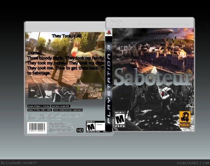
1) I dislike the logo.
2) The back is partially hidden.
3) The word "journal" on the back is unnessecary.
4) Cartoon violence? Teen? The description definately sounds M-rated (and great) to me.
5) This isn't a flaw, but out of curiousity, is this a real game?
Yes it is.
I am leaving the journal because it is that guys Journal. I am not good at making logos at all. What do you mean by partially hidden? So that leaves the description. I will fix that.
 Saboteur Box Cover Comments
I am aware of some of the template oddities. I will fix them.
[ Reply ]
*Doesn't comment*
[ Reply ]
Go away.......please.
[ Reply ]
JK?
[ Reply ]
Yes. I was joking. This box is actually ok.
___Flaws____
1) I dislike the logo.
2) The back is partially hidden.
3) The word "journal" on the back is unnessecary.
4) Cartoon violence? Teen? The description definately sounds M-rated (and great) to me.
5) This isn't a flaw, but out of curiousity, is this a real game?
[ Reply ]
Fix those, and I could see a 5/5 in your future.
[ Reply ]
Yes it is.
I am leaving the journal because it is that guys Journal. I am not good at making logos at all. What do you mean by partially hidden? So that leaves the description. I will fix that.
[ Reply ]
#7, I mean the front is covering part of the back up. And, I mean that I think the game should be rated M.
Also, PLEASE tell me this is coming to X360 as well. I refuse to give Darth Sony $600 of my hard-earned cash, but I HAVE to play this.
[ Reply ]
#8, Darth Sony....hehe....that made my day.
[ Reply ]
Yes it is.
[ Reply ]
#9, thanks. You're welcome.
[ Reply ]
#10, YAHOO! THAT made my day!
[ Reply ]
That is intended for the front.
[ Reply ]
#13, oh.
4/5 so far.
[ Reply ]
Sorry but i do not like it
1. I do not like the logo .
2. The back is very borning .
3. I don't like the text font on the back .
4. The copyright info on the back is badly cut out .
3/5
[ Reply ]