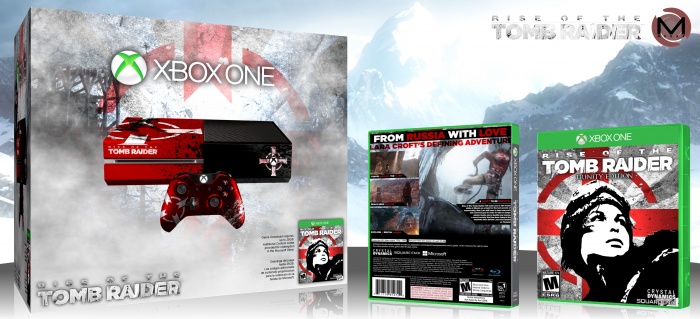
As soon as I found out that one of the major settings in Rise of the Tomb Raider will be in Siberia, I automatically thought of Russia...which lead me to think of the Soviet era...and communism...and propaganda posters...
So that's where the concept came from.
Everything here is custom, even that Xbox One. Also, quality dropped on the front and back covers while I was changing their perspective, so check out the printable for HD viewing.
As always, enjoy!
[ Box updated on February 12th, 2015 ] [ original ]
 Rise of the Tomb Raider Bundle Box Cover Comments
Comment on Mukar's Rise of the Tomb Raider Bundle Box Art / Cover.

First Favorite! Amazing work man! 9/10
[ Reply ]
Very Nice My Friend ;)
[ Reply ]
Great work man,
[ Reply ]
It's a great work. Front is good and different, but I don't like the back, it's empty and doesn't have a certain structure . . .
[ Reply ]
It really is a good design , I like it
[ Reply ]
This is great man! I really love it!
Could you give me a link to the screenshots you used on the back? I've never seen them (apart from the middle one, with Lara looking over the snowy mountains)
[ Reply ]
Thanks :3
Yeah, someone leaked next month's Game Informer coverage from the digital issue:
link
[ Reply ]
Really cool, I like the propaganda style. Although the back, as mentioned, is a bit too spacious. Maybe a different pic would have fit? Still a unique idea though.
[ Reply ]
Really like the propaganda poster approach. I think the console might be an overkill as it takes away from a really great design. The back seems a bit disconnected from the front's striking style, but I can still appreciate the creativity a lot.
[ Reply ]