![]() »
»
Hey!
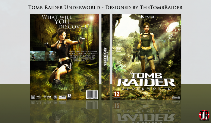
So here's my new cover: 'Tomb Raider Underworld'
I'm going to try and make a cover for every Tomb Raider game that I haven't done yet. So sorry in advance if you don't like Tomb Raider.
A big thanks goes to Matknapers18, Paper, FrankBedbroken and Higashi89 for their help in the WIPs! You guys are awesome!
Thanks for looking, constructive criticism is appreciated! ^.^
 Tomb Raider Underworld Box Cover Comments
Comment on TheTombRaider's Tomb Raider Underworld Box Art / Cover.
Good work man , but text need more work again , I don't like texture you use for overlay ( I guess texture opacity is high , I think 60 opacity is better )
Remove Lens flare tool , it's unnecessary , good brush you use in this one , next time try to use template too :)
[ Reply ]
The lens flare contributes to the dynamic lighting the front and back has, that's why it's there. The texture isn't actually a texture, it's just a map set to overlay. The map is there due to it being a Tomb Raider game, and Underworld in particular takes you all around the world. I always use these style templates because I think they look neater and it leaves room for more design work.
Thanks for the feedback anyway Iman ;)
[ Reply ]
GOOD JOB AND NICE
[ Reply ]
THANKS AND THANKS ;D
[ Reply ]
Very Nice Nathan ;)
[ Reply ]
Thank you Amin ;)
[ Reply ]
Nice Man!
[ Reply ]
Thanks JR! :)
[ Reply ]
Have you done the tombraider game from the pizza hut demo disc? lol anyone remember those??
[ Reply ]
That was a thing? O_O
[ Reply ]
Nice work nathan
[ Reply ]
Thanks ;)
[ Reply ]
While I can't stand Underworld, your box would totally make me buy it if I saw it!
[ Reply ]
I like Underworld, but it's definitely not the series' greatest moment.
Thank you, Sarashi! ^.^
[ Reply ]
This came out awesome.
[ Reply ]
Thanks Mat ;)
[ Reply ]
Hey Came together really well!
[ Reply ]
Thanks, PS! ^.^
[ Reply ]
I could tell this was a boxart by you just by looking at the thumbnail, lol.
Anyway, I really like how this turned out. Simple layout that looks really great. Love the overlap of the headline on the back. Though only thing I'm not a fan of is the the capitalization of every character in the summary. It's drawing way too much attention away from everything else.
[ Reply ]
Thank you!
I'm not sure whether to take that as a compliment or not... I'll go with the first lol
It's the font, the lower case characters appear to be upper case, but they're slightly smaller.
[ Reply ]
Good work Nathan. I feel like your back cover is more of a poster then a cover but it still looks lovely. But I think thats again because of what I said last time
[ Reply ]
Thanks Vince ;)
[ Reply ]
Nice work! so which game will you do next?!
[ Reply ]
I think I'll do Tomb Raider Anniversary
[ Reply ]
You're a beast when it comes to lighting effects, nice work.
[ Reply ]
I'm usually awful at lighting to be honest, it's only recently I've improved, and it's mainly due to others' opinions, mainly yours tbh. So thanks!
[ Reply ]
@TheTombRaider Stop you're gonna make me blush.
[ Reply ]
Congratulations Nathan
[ Reply ]
Thank you! :)
[ Reply ]
Congratulations my friend
[ Reply ]
Thanks! ^.^
[ Reply ]
Congrats dude...
[ Reply ]
Cheers JR! ;)
[ Reply ]
Congratulations man, this is my favourite one of the collection so far
[ Reply ]
Thanks Vince, mine too :)
[ Reply ]
Congrats ;)
[ Reply ]
Thanks Amin :)
[ Reply ]
Congrats Nathan . . .
[ Reply ]
Thanks Matin ;)
[ Reply ]
Hey! Congrats man really well deserve, love this box.
[ Reply ]
Thanks PS ^.^
[ Reply ]
Congrats! Well deserved! :)
[ Reply ]
Thanks Mat! :)
[ Reply ]
I like the lens flare you got going on on the front and the back. As for the template, if you don't wanna use it, you don't have to. The colortones aren't anything new, but I do like the scheme you have going on. Nice work.
[ Reply ]
Thanks man :)
[ Reply ]
Congrats ! :D
[ Reply ]
Thanks! :)
[ Reply ]