Hey!
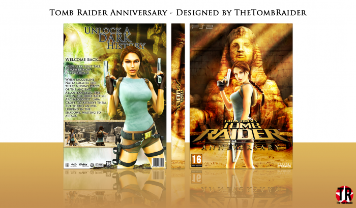
Here's my new Tomb Raider cover for the series. I don't think this is as good as my previous ones; I think the back is weak. I would've spent more time on it and used the WIPs but the back was really annoying me, and I felt like being independent. So here you go.
Sorry if it feels a little too similar to my TR:U box (with the saturated look), it's because I was working on these simultaneously. My next TR cover looks nothing like this.
Constructive criticism is appreciated ^_^
 Lara Croft Tomb Raider: Anniversary Box Cover Comments
Comment on TheTombRaider's Lara Croft Tomb Raider: Anniversary Box Art / Cover.

I really like the front, but the back doesn't feel connected to it.
I think it's the colors. The front feels very warm, but the back relies more on washed out colors. Also, I'm not really comfortable with the white drop shadow on the text on the back. I'm faving for that front, but, yeah, it's not really your best job. Sorry if I seem kinda harsh. :/
[ Reply ]
No, it's fine Frank.
Like I said in the description, I'm really not feeling the back that much. The text is the problem, I just didn't know how I wanted to arrange it, and how to make it stand out, etc.
[ Reply ]
the whole thing is good but the front is the best :)
[ Reply ]
Thanks, I agree ;)
[ Reply ]
Although there's nothing wrong with the box per say, I don't like the sameness it has to your last one; feels kinda uninspired to me.
and as a whole, the last one did look better.
[ Reply ]
As I said, I worked on these simultaneously, so that's most likely why. My next TR cover I'm working on looks completely different. And, like you said, I do prefer the Underworld one anyway.
[ Reply ]
The fronts pretty cool, if not a little over saturated imo, I think the biggest issue with the back is lack of structure, has a really weird flow to it, I agree with the others the sudden colour scheme change really bright orange to a greenish tint makes it feel really disconnected.
[ Reply ]
Thanks for the feedback, PS! I think I'll update this tomorrow.
[ Reply ]
wow nice my friend
[ Reply ]
Thanks James
[ Reply ]
Nice Work!
[ Reply ]
Thanks JR! ^_^
[ Reply ]
i
l
i
k
e
i
t
nathan
[ Reply ]
Good work Nathan, like you said the issue I think with the back is the text. Im sure if you put your head to it with some more time, you could fix this though.
But another excellent design man! Will keep an eye out for the next one!
[ Reply ]
Thanks Vince! ;)
[ Reply ]