![]() »
»
Hey!
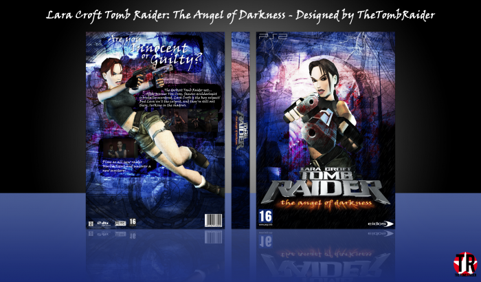
Here's the next cover in my Tomb Raider series, Angel of Darkness!
I'm quite happy with the result. The front has been through the WIPs, the back has not (it's probably obvious, lol)
Huge thanks to Paper and FrankBedbroken for their help in the WIPs! ^.^
Tah
 Lara Croft Tomb Raider: Angel Of Darkness Box Cover Comments
Comment on TheTombRaider's Lara Croft Tomb Raider: Angel Of Darkness Box Art / Cover.
Came together really nicely, Love the colour scheme, back looks a little rushed but all in all super solid design, looking forward to the next one =)
[ Reply ]
Yeah, I won't get chance to work on anything over the weekend; that's why I had to rush the back a little and didn't bother putting it through the WIP. Thanks, PS :)
[ Reply ]
So cool
Your colour scheme are amazing
Nice work
[ Reply ]
Thank you! :)
[ Reply ]
Turned out great, love the color scheme on the front also! I think that the screenshots could've been placed better :/
[ Reply ]
Yeah, they could, as I explained above the back was a little rushed :/
[ Reply ]
I like this a lot, the darker tones definitely fit the vibe of the game. The back isn't bad either IMO, but I prefer the front myself. Good job, Nathan! :)
[ Reply ]
Thanks Frank :)
[ Reply ]
I prefer the front.. (:
[ Reply ]
So do I JR, thanks ;)
[ Reply ]
wow again nice work
[ Reply ]
Thanks :)
[ Reply ]
That's a pretty nice box, but there's 2 things that I wanna notice,
1st is that the tagline is un unreadable, some how blended in background,
2nd is the ps2 template, if u ask me it could be better with a official template, other than that it's a nice box, good job, :")
[ Reply ]
Thanks Ali ^.^
[ Reply ]
The colours I find quite overwhelming to be honest. I think if it was a more Matt grey blue it would have looked nicer. The front does shout tomb raider and the overall design it quite nice. I'm just not a fan of the colour. I also agree with what Ali said and think the screenshots are too dark...
Much prefer your previous 2 boxes.
[ Reply ]
The reason it is quite dark is because the game is really dull. And the bright blue is present throughout the game.
Thanks anyway, Vince ;)
[ Reply ]
@TheTombRaider fair enough then, If it suits the atmosphere of the game. I have never played it...
[ Reply ]
@Vince_1990
I recommend that you stay far away from it then, lol. Definitely not the Tomb Raider series' greatest moment.
[ Reply ]
Very Nice Nathan ;)
[ Reply ]
Cheers Amin :)
[ Reply ]
very nice
[ Reply ]
Thanks ;)
[ Reply ]
I like that you tried to do something new, bot goddamn is that background ever an eyesore.
[ Reply ]
Haha, that's ok :)
[ Reply ]
like nathan
[ Reply ]
Thanks
[ Reply ]
Congrats TR =)
[ Reply ]
Thanks PS :)
[ Reply ]
Congratulations Nathan
[ Reply ]
Thanks Vince :)
[ Reply ]
Congrats Nathan ;)
[ Reply ]
Thanks Amin :D
[ Reply ]
Congrats!
[ Reply ]
Thanks!
[ Reply ]
Congrats Dude . . .
[ Reply ]
Thanks Matin ;)
[ Reply ]
Thanks for the tenth HOF! Wasn't expecting this to get in the HOF...
[ Reply ]
I love it. Reminds me of the 90s. The feel of holding the box in my hands as I put the CD in the tray.
[ Reply ]
Haha, thanks!
[ Reply ]
Congrats!!!! :)
[ Reply ]
Thanks!!!! :)
[ Reply ]