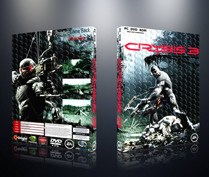
The layout doesn't seem bad by any means, but I think the background images are too harsh and they subtract from the images on the back, which also seem very harsh in terms of light.
Also, the text at the top of the back cover is barely legible because of this. I think this cover would look leaps and bounds better if the hexagonal background wasn't as fierce; perhaps try to lower the opacity?
 Crysis 3 Box Cover Comments
This looks suspicious to me.
[ Reply ]
The layout doesn't seem bad by any means, but I think the background images are too harsh and they subtract from the images on the back, which also seem very harsh in terms of light.
Also, the text at the top of the back cover is barely legible because of this. I think this cover would look leaps and bounds better if the hexagonal background wasn't as fierce; perhaps try to lower the opacity?
[ Reply ]