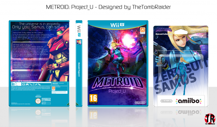
So this is my cover for Metroid on Wii U. Hoping that Nintendo will reveal it at E3 next month. Since it hasn't been revealed yet, Project_U is obviously a placeholder name.
Constructive Criticism is appreciated :)
 Metroid: Project_U Box Cover Comments
Comment on TheTombRaider's Metroid: Project_U Box Art / Cover.
I really like the front, but I feel like the back's a bit too textheavy, although I do get there isn't really much stuff to work with. Still, I quite like it. Good job, Nathan. :)
[ Reply ]
I thought the same thing. I was going to add screenshots but for obvious reasons I can't. I could have made my own, but I'm too lazy for that.
Thanks Frank :)
[ Reply ]
I really like this. Though, the template itself seems a little scarce on the back? I think you did a really good job with the amiibo especially and I like how the back turned out best.
[ Reply ]
Thanks a lot Lucid! ^_^
[ Reply ]
@Lucidhalos nah that's just how the European Wii U templates are.
Nice job TR! I like the Colour scheme alot, looks very space-y and fits well with the Metroid series, I'm personally hoping they announce an Animal Crossing title for the Wii U this E3, that would be amazing.
[ Reply ]
@Paper Oh yeah, that would be awesome!
Thanks Paper :)
[ Reply ]
@Paper There is a a new Animal Crossing game coming out for the 3DS, one that utilises amiibo cards bu a wii u one would be pretty cool. I myself is looking forward to Starfox Wii U!
[ Reply ]
To me, the back doesn't look "dynamic" enough compared to the front which is really awesome (and the amiibo looks cool too). But I guess I can't really blame you, considering that this isn't an official game (yet?).
So once again, you did it great ;)
[ Reply ]
Thanks man :)
[ Reply ]
Nice, love the strong colors and great design
[ Reply ]
Thanks man :)
[ Reply ]
Wow that's lot of text dude...haha
But it doesn't look bad
Nice job (:
[ Reply ]
Btw I love the colors...
[ Reply ]
@Jullrouu Thanks JR :)
[ Reply ]
Love the colour scheme and the amiibo is quite cool. For me the cosmos just looks kinda weird on the front where samus's head looks like its exploding.
[ Reply ]
Thanks man, yeah I see what you mean, that's just a personal effect that I like :)
[ Reply ]
Ni've work Nathan, but I agree with Frank about the back
[ Reply ]
Ni've? xD
Thanks Vince, as explained, there wasn't a lot I could do with the back because obviously there aren't any screenshots.
[ Reply ]
Good job nathan . . .
[ Reply ]
Thanks Matin! :)
[ Reply ]