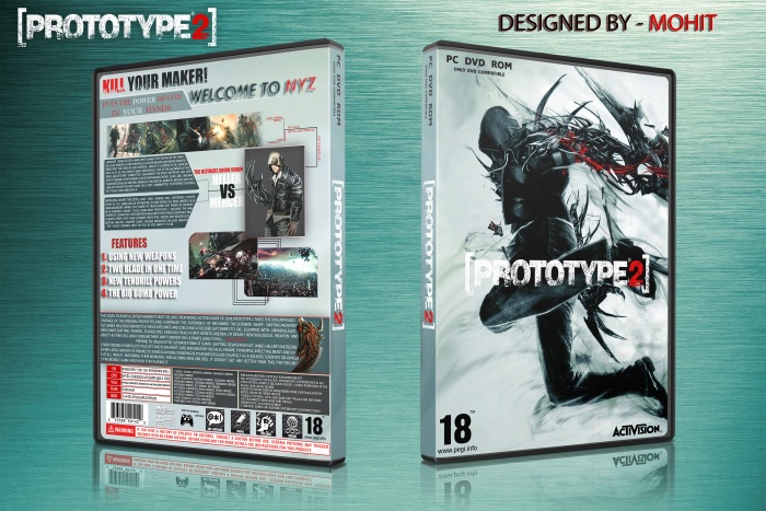
Although you have some nice structuring going on here and some nice little blemishes, there are some parts that i feel I have to jump on...
You to be using a lot of different font styles. Try and keep it to 2 -3 fonts in one design, including the logo I can see 5 - 6 different fonts.. Also Under the features, I do not like the drop shadow behind the text. I feel you should have just changed the colours and that would look nicer.
My main issue isnt really your fault. I personally dont really like plain background covers, (Unless its simplistic) But when its like the design is always missing something...
 Prototype 2 Box Cover Comments
Although you have some nice structuring going on here and some nice little blemishes, there are some parts that i feel I have to jump on...
You to be using a lot of different font styles. Try and keep it to 2 -3 fonts in one design, including the logo I can see 5 - 6 different fonts.. Also Under the features, I do not like the drop shadow behind the text. I feel you should have just changed the colours and that would look nicer.
My main issue isnt really your fault. I personally dont really like plain background covers, (Unless its simplistic) But when its like the design is always missing something...
Hope this helps.
[ Reply ]
Thanks for tips I will do my best:D
[ Reply ]
I agree with Vince, but I applaud your creativity on the back. It looks really original.
[ Reply ]
its perfect man
[ Reply ]
Back is AMAZING!!!! I love it. Nice job bro.
[ Reply ]