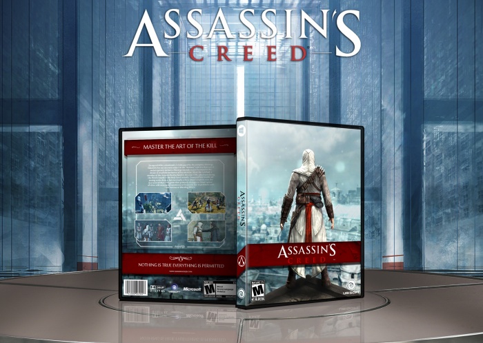
The front looks different from most AC covers and an effective/simple back layout, does its job.
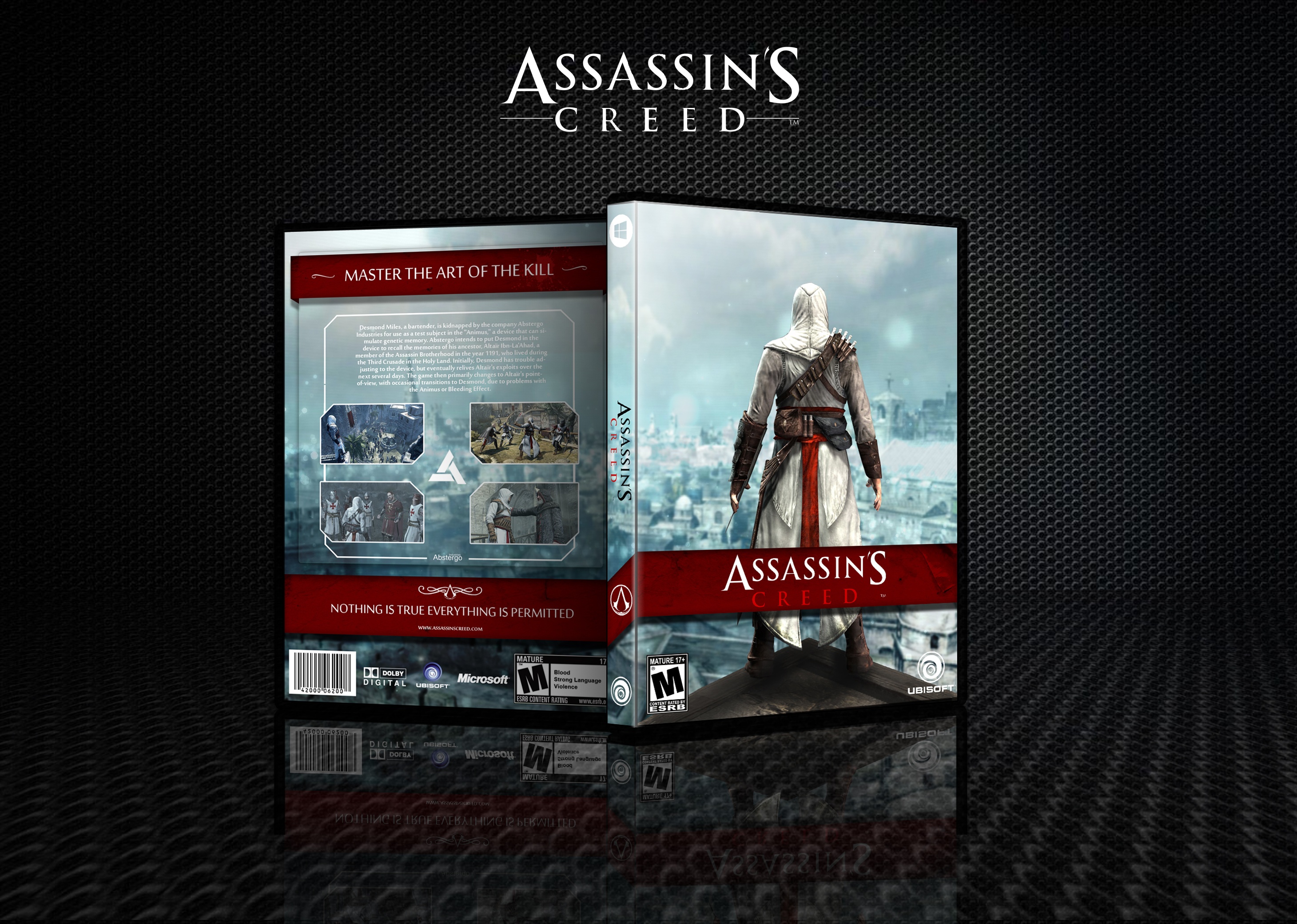
I could only suggest to up the sharpness of the box/images and tone down the background of the presentation or just make it less present. another option is just to get rid of that texture (it doesn't really fit the box, to be honest)
 Assassin's Creed Box Cover Comments
My friend had to leave a good card :-$
[ Reply ]
Simple, but I like it. The overall layout is quite similar to your previous boxes though, would like to see something different from you next :)
[ Reply ]
Well Done Body
[ Reply ]
'Body'? Serious :/
[ Reply ]
The front looks different from most AC covers and an effective/simple back layout, does its job.
I could only suggest to up the sharpness of the box/images and tone down the background of the presentation or just make it less present. another option is just to get rid of that texture (it doesn't really fit the box, to be honest)
[ Reply ]