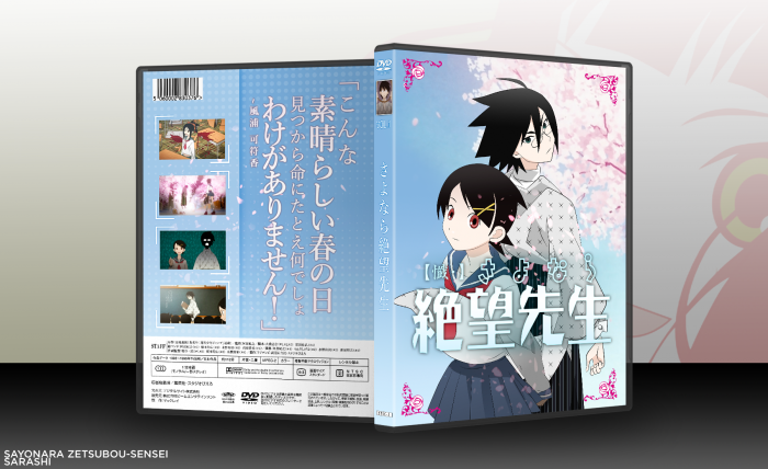
Hey, all. Decided to dabble in some custom art-ish traces for making a box. Was difficult to pick a topic, so I decided to do a movie/anime box because I've never tried doing one before (I hope I don't get ripped apart by the very particular anime fans of VGBA). I decided on Zetsubou-Sensei because I liked the series, but mainly because of the easier linework (yeah it really was that simple).
I decided to go with a juxtaposition box- not unlike a certain magical girl series which I totally was fooled by. As a concession, I decided to put some pretty representative screenshots in instead.
Credit to NeoGAF for the plastic.
 Sayonara, Zetsubou-Sensei Box Cover Comments
Comment on Sarashi's Sayonara, Zetsubou-Sensei Box Art / Cover.
Nice colours and simple design. Good work
[ Reply ]
Nice approach in making an movie/anime box art, as well with it being targeted to the eastern region (aka japanese box art). I like how everything is simple, how those ornaments in the corners of the front cover influences with he whole design and the cherry tree patterns are a great touch.
[ Reply ]
I can clearly see the efforts that you put in the front, and the result is really great!
But compared to that, the back looks quite borring...
[ Reply ]
It is a totally fair comment, but I decided to make it that way to focus on the quote- after all, any more characters I decide might fit will take a long time to produce and might end up not fitting in properly. I guess I took a safer route than usual (and that's saying something considering I always try to make safe decisions).
[ Reply ]
Awesome Job, I love the colours and the custom art is as impressive as always, keep it up! =)
[ Reply ]
That front looks amazing. The back's a bit simple compared to the front, but it works well in my opinion. Nice job! :D
[ Reply ]
Just realised I have the wrong season's logo- oh well... it's not like anyone will notice or care.
[ Reply ]
Sometimes I give up on updating some of my boxes simply because no one thinks a specific detail bothers them. So why should I, I ask myself
[ Reply ]
one of my favorites from you. kinda random but are you from France?
[ Reply ]
I was born there if that's what you're asking. Currently living in the UK.
[ Reply ]
I like the layout.
[ Reply ]
this looks pleasing to the eye ;) well done.
[ Reply ]
I really like how this turned out. The back is simple, but it's nicely done with little details (like the sakura petals and the detail around the screenshots). It may look a bit bare, but it doesn't take away from the overall design. I think you did a really great job.
[ Reply ]
Nice colour
[ Reply ]
Great
[ Reply ]