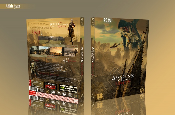
Much better to your older cases, the font choice fits the game more too. Overall much better design and structure for the back.
My main issue with this case is the unnecessary text, such as, "HD Gameplay & Screenshots" People know they are looking at screenshots, so why say it... HD gameplay isnt really something to brag about anymore either.
Lastly, its the text you are using for the features block. Try to make them more snappy. Bullet points about what this game has which others dont. I use ign.com a lot for my text. It has everything about games from features, summarys, game editions etc... Have a look for this one for the features.
 Assassin's Creed Unity Box Cover Comments
Cool and awesome
[ Reply ]
Thanks.
[ Reply ]
Much better to your older cases, the font choice fits the game more too. Overall much better design and structure for the back.
My main issue with this case is the unnecessary text, such as, "HD Gameplay & Screenshots" People know they are looking at screenshots, so why say it... HD gameplay isnt really something to brag about anymore either.
Lastly, its the text you are using for the features block. Try to make them more snappy. Bullet points about what this game has which others dont. I use ign.com a lot for my text. It has everything about games from features, summarys, game editions etc... Have a look for this one for the features.
link
[ Reply ]
Thanks for the link teacher.
[ Reply ]
That last screenshot is from AC3.
[ Reply ]
I do not have much knowledge about games and movies I will correct it for my next work.
[ Reply ]
What about the box.
[ Reply ]
@adhirjaan Love the front, the back could use work (language and presentation).
It's going well though.
[ Reply ]
@MJ_Designs thanks for feedback
[ Reply ]