New box!
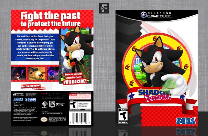
So, here's what I've made for the Round 3. I feel like I'm cheating a bit with this, but whatever, Shadow the Hedgehog! The game is... not good, and it's not really horror, but I guess it does count, maybe, I don't know. I envisioned this to be more cringy, to be honest, but it just ended up looking like another Sonic box, so... whatever. This is definitely not my best box at all, so I don't really expect much people liking this, to be honest.
Anyways, as always, constructive criticism is welcome and huge thanks to Takahashi2212, Huegh, Sarashi and Higashi89, for their help and feedback on the forums, it's greatly appreciated. Also, credit to EdwardPines for his template, Cerium for the Sonic Team logo, and Titan38 for the ESRB's.
Hope you guys like it! :)
 Shadow the Hedgehog Box Cover Comments
Comment on FrankBedbroken's Shadow the Hedgehog Box Art / Cover.
It uploaded correctly this time, after three times trying. Yay.
[ Reply ]
So it uploaded correctly after your fourth DAMN time?
[ Reply ]
@SonixDaName99 Yes, it DAMNED did.
[ Reply ]
@FrankBedbroken Jokes aside, even though you said it's not your best box I still think each one of your boxes is at top quality status.
[ Reply ]
@SonixDaName99 Thanks, dude! Personally I don't think my stuff is top quality, but well, to each their own. :D
[ Reply ]
Nice job Frank. I do feel like this isn't as strong as your usual works (the front seems a little empty and the bottom of the back also seems a little empty) but it's still a great design. I would've helped on the WIP but I've been absent for a few days due to exams and stuff. Great job on the whole :)
[ Reply ]
I reckon you could have justified the description text and made the text boxes at the bottom of the back bigger but it still looks pretty cool. Good job.
[ Reply ]
Nice work
[ Reply ]
As a shadow the hedgehog box I think its great but I'm not really feeling the horror vibe. Nonetheless a great design
[ Reply ]
Thanks, Vince! The theme of this round was to take a dark/spooky game and make it into a happy/cute design, or viceversa. Although I wasn't sure if this game would count, but apparently it does, so I rolled with it.
[ Reply ]
@FrankBedbroken my bad the real box art is quite dark looking. I thought it would have just been normal sonicy style. This is pretty spot on in that case.
[ Reply ]
Huh. Forgot to comment on this.
It's pretty good! The back I feel is actually a bit better than the front. I think it's appealing.
I do wish you included the overly-edgy "ULTIMATE LIFE FORM." written on the left side the posters and box art for the game. Not for any design reason, just because it would've been hilarious.
link
(feint text on the left)
I always feel awkward when this game comes up, because I'm always the one guy who defends this game as "good." I don't think I'll ever be able to truly explain why I like this game, but I'm always the odd man out.
Good job overall, Franco! and good luck on the competition! I wish I could've participated (I might shit something out for R3) but school destroyed all my freetime (and me working on some other box arts).
[ Reply ]
Honestly, this is my favorite Shadow the Hedgehog box besides Eggboy's. I like how elementary, and therefore reminiscent of older Sonic games this is. It's simple, and does the job.
[ Reply ]