Have you ever seen a real box where the logo for the game is tiny and pushed into the corner?
Have you seen a box where the developer logo is unreadable because it's black text on a very dark grey background?
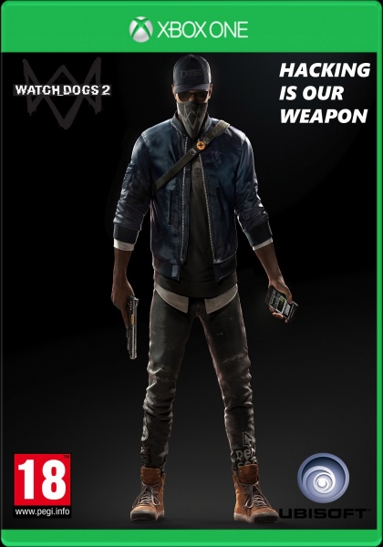
Is one character on a black-grey gradient an interesting image- would you pick it up off the shelf instead of anything else on display at the store?
Please consider these questions and come to your own conclusion about the effectiveness of your design as a cover.
Thank you for your feedback. I would consider that in future. Definitly going to make other cover for the game. I started with Photoshop 3 days ago, so i know very little amount of it.
P.S. Saw your work a minute ago. Great stuff ;)
 Watch Dogs 2 Box Cover Comments
1.5/5.0
[ Reply ]
Have you ever seen a real box where the logo for the game is tiny and pushed into the corner?
Have you seen a box where the developer logo is unreadable because it's black text on a very dark grey background?
Is one character on a black-grey gradient an interesting image- would you pick it up off the shelf instead of anything else on display at the store?
Please consider these questions and come to your own conclusion about the effectiveness of your design as a cover.
[ Reply ]
Thank you for your feedback. I would consider that in future. Definitly going to make other cover for the game. I started with Photoshop 3 days ago, so i know very little amount of it.
P.S. Saw your work a minute ago. Great stuff ;)
[ Reply ]
Please try again
[ Reply ]
+1
[ Reply ]
I agree, actually. Not my best, but I'm going to learn on my mistakes
[ Reply ]
You guys are harsh lol
[ Reply ]