I made this. I don't know WHY I made this, I just had a weird urge to. GTA IV in FF style. Enjoy.
 Grand Theft Auto IV Box Cover Comments
Comment on danny-21_'s Grand Theft Auto IV Box Art / Cover.
I made this. I don't know WHY I made this, I just had a weird urge to. GTA IV in FF style. Enjoy.
Comment on danny-21_'s Grand Theft Auto IV Box Art / Cover.
Hmm, interesting concept.
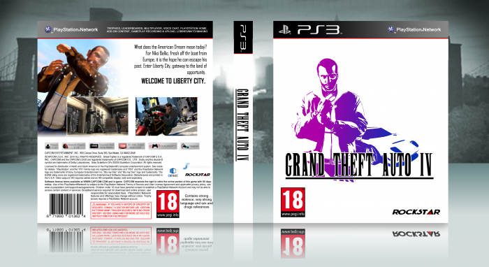
Let's go over some of the finer points:
You have used the fanmade 'Final Fantasy' font for the logo, but that font has the letter I and the rest of the letters a different size.
You have used an NTSC template but for some obscure reason you have decided to poorly convert it to a PAL one.
Official Final Fantasy boxes tend to be very bland, so this is rather uninspired. It would have been better had you stretched yourself and attempted something akin to the official [PAL] FFXIII's back cover with the screenshot collage. Perhaps maybe like the Dissidia Final Fantasy cover either.
I also think that your logo is lacking the finesse of the Amano artwork logos and there is no outline nor colour depth of the official Amano logos.
So all in all while you sort-of achieved what you wanted to do, your execution leaves a lot to be desired.
[ Reply ]
Thank you for your feedback :) I shall respond to your criticisms individually.
Yes, you are correct in saying I used the fanmade FF font for the logo. It's the first one I found and it seemed okay to me (I didn't consider such fine details in what was ultimately a joke-concept box)
I did use an NTSC template, and the reason I (admittedly poorly_ converted it was for a variety of reasons, primarily that the US didn't really get this style of FF box, and also that PAL templates are lacking on this site
I agree that, to a degree this is uninspired, but in my mind the only inspiration I needed was the very basic concept that it's a classic FF box, but for GTA. I feel like if I expanded upon that too much it'd become too unrecognizable.
And yeah, I agree the logo lacks finesse but I really didn't know what to do in that regard.
So yeah, it's clear you definitely know your stuff and are passionate about the FF boxes, but you should know this wasn't meant to be anything too serious :) thank you very much for the constructive criticism and I shall work on these in future.
[ Reply ]
LOL
[ Reply ]
Wow nice I wonder where you got the inspiration from?
[ Reply ]
why are you being autistic
[ Reply ]
buddy trust me you aren't the first person to do a parody GTA cover
[ Reply ]
I actually quite like this, it's creative.
I feel that the front and back are a little disconnected though, like, the front has that vivd gradient whereas the back is very bland in terms of colour. Also, while I completely understand you were going for the typical FF simplicity, I think the front is a little too plain. Perhaps you could have included some sort of environment behind the render but keep it barely visible, so it almost looks like plain white, but it isn't.
As for the back, I find the structure a little odd. Having the text coming from the right doesn't seem right to me, you should have it coming normally from the left but possibly indent each line so it spreads across the screenshot and into the empty white space (if that makes any sense). I'd also like to see some colour.
Hope my feedback was useful! :)
[ Reply ]
Thanks for the feedback! Yeah I agree with all of your points here. And tjank you for your kind words :)
[ Reply ]
The front looks nice, the back doesn't flow well with the front (in terms of color and layout) though and it looks really unfinished/basic.
I didn't knew 'Rockstar Games' used to have that logo repesenting their company?
[ Reply ]
interesting concept, needs work though
[ Reply ]
That looks...AMAZING
[ Reply ]