![]() »
»
Hey!
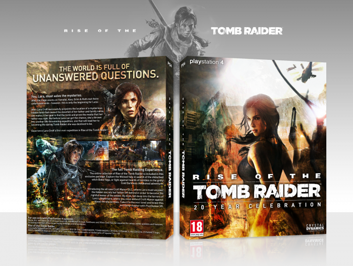
So either everyone is going to think this looks pretty cool or a total mess. They revealed this the other day so as you all probably expected I made a box for it.
Feedback appreciated!
 Rise of the Tomb Raider: 20 Year Celebration Box Cover Comments
Comment on TheTombRaider's Rise of the Tomb Raider: 20 Year Celebration Box Art / Cover.
i don't like the playstation 4 logo text
[ Reply ]
That's the font they use for the PlayStation logo... but okay
[ Reply ]
This looks damn nice, good job
Gets a little messy and crowded on the back with all the conflicting textures and colours, particularly at the bottom of the lara render on the left, but its easy to overlook
[ Reply ]
Yeah I know what you mean, I wasn't sure whether it looked good or too messy. Thank you! :)
[ Reply ]
Dope dope dope. Peep the logo too *ok hand*
[ Reply ]
Thanks thanks and thanks :)
[ Reply ]
The front looks pretty sweet, especially the lightning. It's a bit text-heavy on the description, but I do like the contrast and layout on the back.
This still looks a lot better than that simplified look on the official box.
[ Reply ]
Thanks a lot! :)
[ Reply ]
Nice one! I like the colors and the gritty atmosphere of the design. Well done.
[ Reply ]
Thank you ^^
[ Reply ]
The back seems quite text heavy, but overall a great design.
[ Reply ]
Awesome box! Congrats on HOF!
[ Reply ]
congrats.very nice.<3
[ Reply ]
Didn't expect that, thanks guys! ^^
[ Reply ]
very nice man
[ Reply ]
thanks ^^
[ Reply ]
The only weird thing I see is the Playstation text. Make the whole thing either bold or thin. Just look weird how it is :/
[ Reply ]