remember Adam2027 capcom [ Buy Remember Me at Amazon ] » 2017 Hall of Fame Winner! By Adam2027 37 on August 29th, 2016 No Printable Available Please see in full size. Remember Me Box Cover Comments Comment on Adam2027's Remember Me Box Art / Cover. Cancel Reply Bastart 49 [ 7 years ago ] There are some typos and text issues, but the overall design looks good. [ Reply ] Adam2027 37 [ 7 years ago ] Tnx dude,how i can improve that? [ Reply ] Bastart 49 [ 7 years ago ] @Adam2027 try fixing the typos like 'rimix' etc. and the missing spaces between some words in the synopsis. The gaps between the words are also a little distracting to me, I'd suggest a different alignment of the paragraphs. [ Reply ] Bastart 49 [ 7 years ago ] To add on the above; the 'Feature' header should be 'Features' and the review quote plus the rating should be moved away from the game quote imo. [ Reply ] deiviuxs 47 [ 7 years ago ] nice design. hi-res images are also a big plus. [ Reply ] Adam2027 37 [ 7 years ago ] Tnx bro :) [ Reply ] TheTombRaider 46 [ 7 years ago ] This is your best design in my opinion, I really like it. Though I'm still not a fan of these landscape, rectangular-shaped boxes. [ Reply ] Adam2027 37 [ 7 years ago ] Tnx dude. I'm glad you like it. :) Yeah i want to change my style for next cover. [ Reply ] Thegamer 37 [ 7 years ago ] Nice,The Back of Cover Awesome.. [ Reply ] ajay. 47 [ 7 years ago ] Nice design [ Reply ] Adam2027 37 [ 7 years ago ] Thanks :) [ Reply ] shiraziha 50 [ 7 years ago ] nice ;) [ Reply ] Adam2027 37 [ 7 years ago ] Tnx a lot Amin. <3 [ Reply ] matingsm 50 [ 7 years ago ] love this, so nice . . . [ Reply ] Adam2027 37 [ 7 years ago ] Tnx bro <3 [ Reply ] shiraziha 50 [ 7 years ago ] congrats bro ;) [ Reply ] Adam2027 37 [ 7 years ago ] Tnx bro ;) [ Reply ] jevangod 50 [ 7 years ago ] Very nice. Love the organization and colors. I would suggest changing the synopsis font on the back to helvectica. Its just a cleaner and nicer font. [ Reply ] Adam2027 37 [ 7 years ago ] Tnx :) I agree with you. I try to change fonts. [ Reply ] matingsm 50 [ 7 years ago ] congrats well deserved . . . [ Reply ] Adam2027 37 [ 7 years ago ] Thank Mr. HOF ;) [ Reply ]
 Remember Me Box Cover Comments
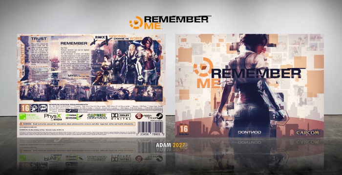
There are some typos and text issues, but the overall design looks good.
[ Reply ]
Tnx dude,how i can improve that?
[ Reply ]
@Adam2027 try fixing the typos like 'rimix' etc. and the missing spaces between some words in the synopsis. The gaps between the words are also a little distracting to me, I'd suggest a different alignment of the paragraphs.
[ Reply ]
To add on the above; the 'Feature' header should be 'Features' and the review quote plus the rating should be moved away from the game quote imo.
[ Reply ]
nice design. hi-res images are also a big plus.
[ Reply ]
Tnx bro :)
[ Reply ]
This is your best design in my opinion, I really like it. Though I'm still not a fan of these landscape, rectangular-shaped boxes.
[ Reply ]
Tnx dude. I'm glad you like it. :)
Yeah i want to change my style for next cover.
[ Reply ]
Nice,The Back of Cover Awesome..
[ Reply ]
Nice design
[ Reply ]
Thanks :)
[ Reply ]
nice ;)
[ Reply ]
Tnx a lot Amin. <3
[ Reply ]
love this, so nice . . .
[ Reply ]
Tnx bro <3
[ Reply ]
congrats bro ;)
[ Reply ]
Tnx bro ;)
[ Reply ]
Very nice. Love the organization and colors. I would suggest changing the synopsis font on the back to helvectica. Its just a cleaner and nicer font.
[ Reply ]
Tnx :) I agree with you. I try to change fonts.
[ Reply ]
congrats well deserved . . .
[ Reply ]
Thank Mr. HOF ;)
[ Reply ]