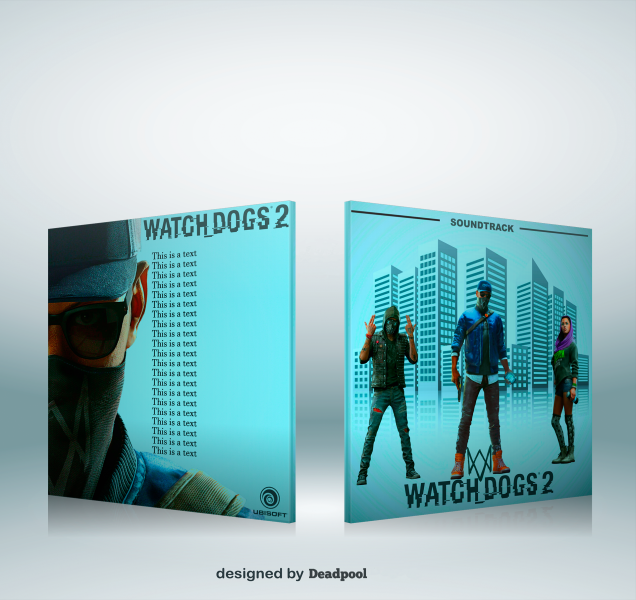
The characters are floating, I'd add some reflection or a shadow. The back could use a background (an image in line with the buildings on the front) and the logo looks a bit cramped (I'd suggest to make it a tad smaller)
well._._.about the he tracklist, what can I say? I guess it's called artistic, to repeat the same line over and over :\ at least the color is nice and the box is quite bigger compared to your previous box, so that's a plus.
To be honest everyone else has covered the main drift. You uploaded it without really finishing it. Characters lack shadows which could help them from looking floaty, the back is too plain and lacks the buildings that the front has, and the sheer laziness to not make up or copy another game's tracklist kinda makes this not that acceptable.
 watch dogs 2 ( soundtrack) Cover Comments
This is a text.
[ Reply ]
This is a text.
[ Reply ]
text a is This
[ Reply ]
@Deadpool Seriously, why? Is it too much effort to make up your own tracklist for the soundtrack? (if so, than that's just the lamest thing out there)
[ Reply ]
The characters are floating, I'd add some reflection or a shadow. The back could use a background (an image in line with the buildings on the front) and the logo looks a bit cramped (I'd suggest to make it a tad smaller)
well._._.about the he tracklist, what can I say? I guess it's called artistic, to repeat the same line over and over :\ at least the color is nice and the box is quite bigger compared to your previous box, so that's a plus.
[ Reply ]
the he? typo.
[ Reply ]
is it a text?
[ Reply ]
To be honest everyone else has covered the main drift. You uploaded it without really finishing it. Characters lack shadows which could help them from looking floaty, the back is too plain and lacks the buildings that the front has, and the sheer laziness to not make up or copy another game's tracklist kinda makes this not that acceptable.
[ Reply ]
This is a text
[ Reply ]
this is a text
[ Reply ]
your work @deadpool is bullshit
[ Reply ]