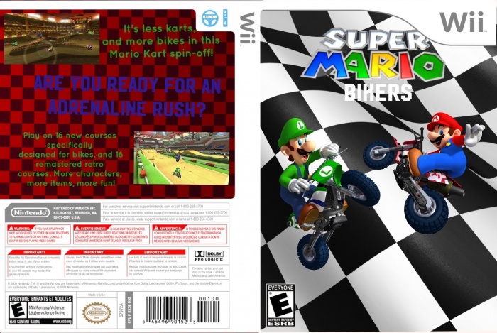
I hope you like my first box. I used PicCollage to make it, and sorry about the blurriness. My computer won't let me do anything about it. Please give feedback!
 Super Mario Bikers Box Cover Comments
Comment on Benjigoo's Super Mario Bikers Box Art / Cover.
Some comments:
1: Super Mario logo looks distorted, was it resized unproportionally?
2. Super Mario logo is touching the Wii overlay, which doesn't look too great. Would recommend setting it lower or making it smaller.
3.The "Bikers" line is hard to see, and in a very low quality font. Would recommend changing the font all together, and maybe rethinking the size and colour of it. Maybe an outline stroke on it would make it more legible?
4. The layout on the back works but the font and the background don't look good together, and make the text almost impossible to read. I'd recommend changing font colours on the back, and maybe changing the background too, to something softer and less glaring than a red. In fact, the flag background on the front may work better in the back of the cover.
5. The problem with the front cover is that there's no sense of space, do you know what I mean? Like, there are pictures of Mario and Luigi in the air with their bikes but no sense of where they were jumping from, or some sense of height, or free space. The flag background looks strange, and makes the cover look claustrophobic. I would personally recommend removing it and replacing it with something else, something less abstract than a pattern. Some kind of landscape, maybe. But this is all just my opinion. Hope this helps.
[ Reply ]
thanks, can you think of any backgrounds that I can use?
Anyways, thank for the advice. I'll fix it as soon as possible.
[ Reply ]
@Benjigoo btw I don't think I can fix the font problem. piccollage doesn't offer many high-quality fonts
[ Reply ]
@Benjigoo Try finding photos from stages like these:
link
link
link
where the perspective looks like it makes sense with the mario and luigi images. Wide looking areas and landscapes would be the best imo, and so would images that are from the same rendering style as the images you have, so basically whatever is in Mario Kart 7+.
[ Reply ]
@shadowYX thanks, how is my other box?
[ Reply ]