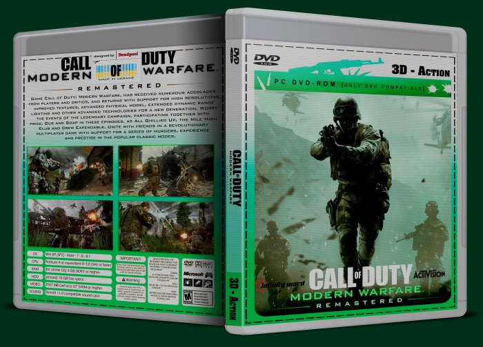
this is a original.something like this))
[ Box updated on November 7th, 2016 ] [ original ]
 Call of Duty Modern Warfare Remastered Box Cover Comments
Comment on Deadpool's Call of Duty Modern Warfare Remastered Box Art / Cover.
your feedback is important to me ... ))
[ Reply ]
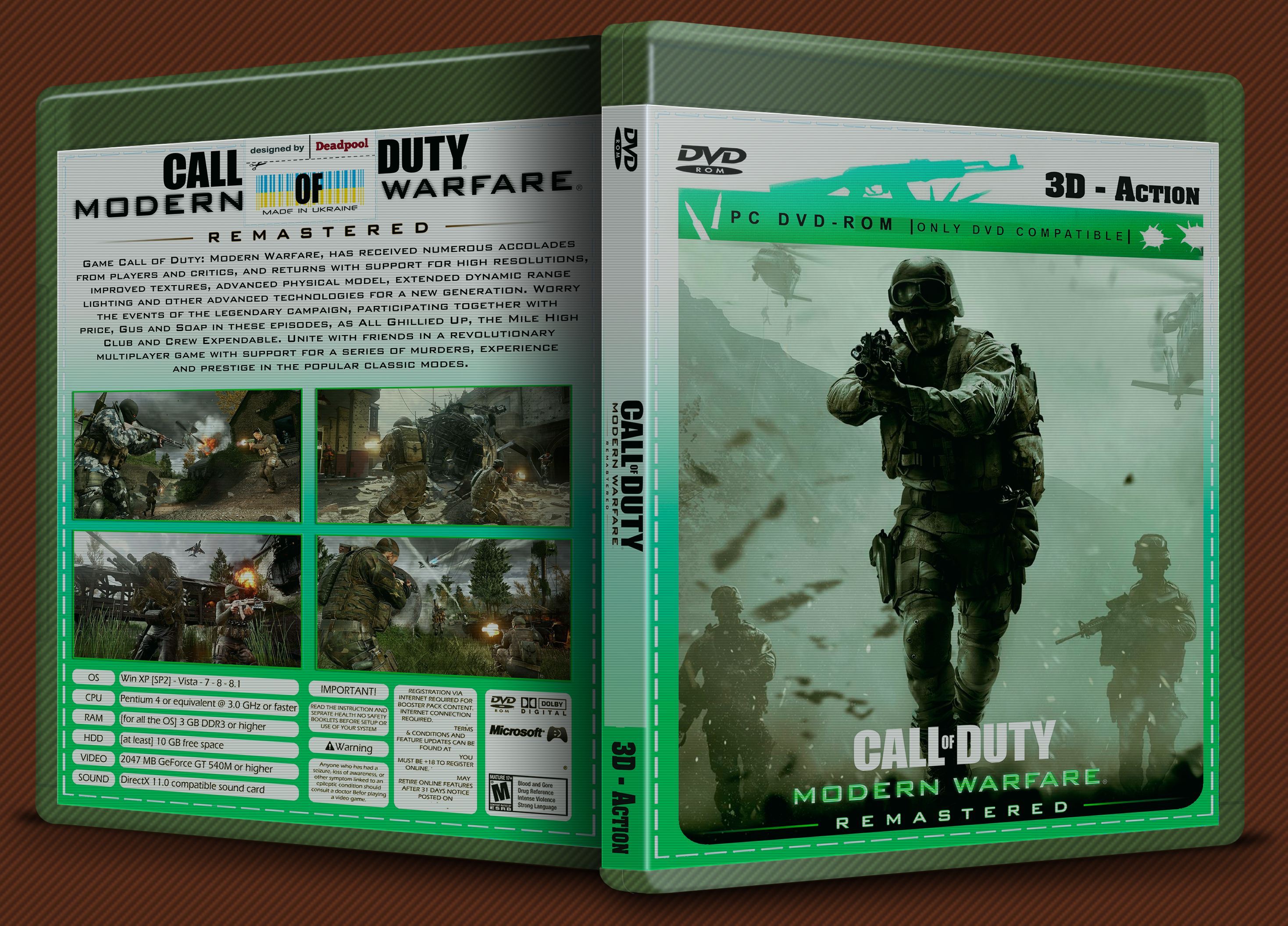
I'd stick with this version and work further from here, it's simple yet effective (don't post multiple version of the same box, just update a previous version if you feel like it) I'd suggest too use a more fitting plastic template (the olive tone does fit the color scheme, but it brings the actual design down quite a bit imo.) Your presentation on this box is also more focused on the box, but the lines would look better if only used on the background. I'd make some more blank space around the box (just don't overdo it) so it doesn't look cramped in a space.
[ Reply ]
plz printabel
[ Reply ]
no problem.enjoy)
[ Reply ]
your work @deadpool is bullshit
[ Reply ]