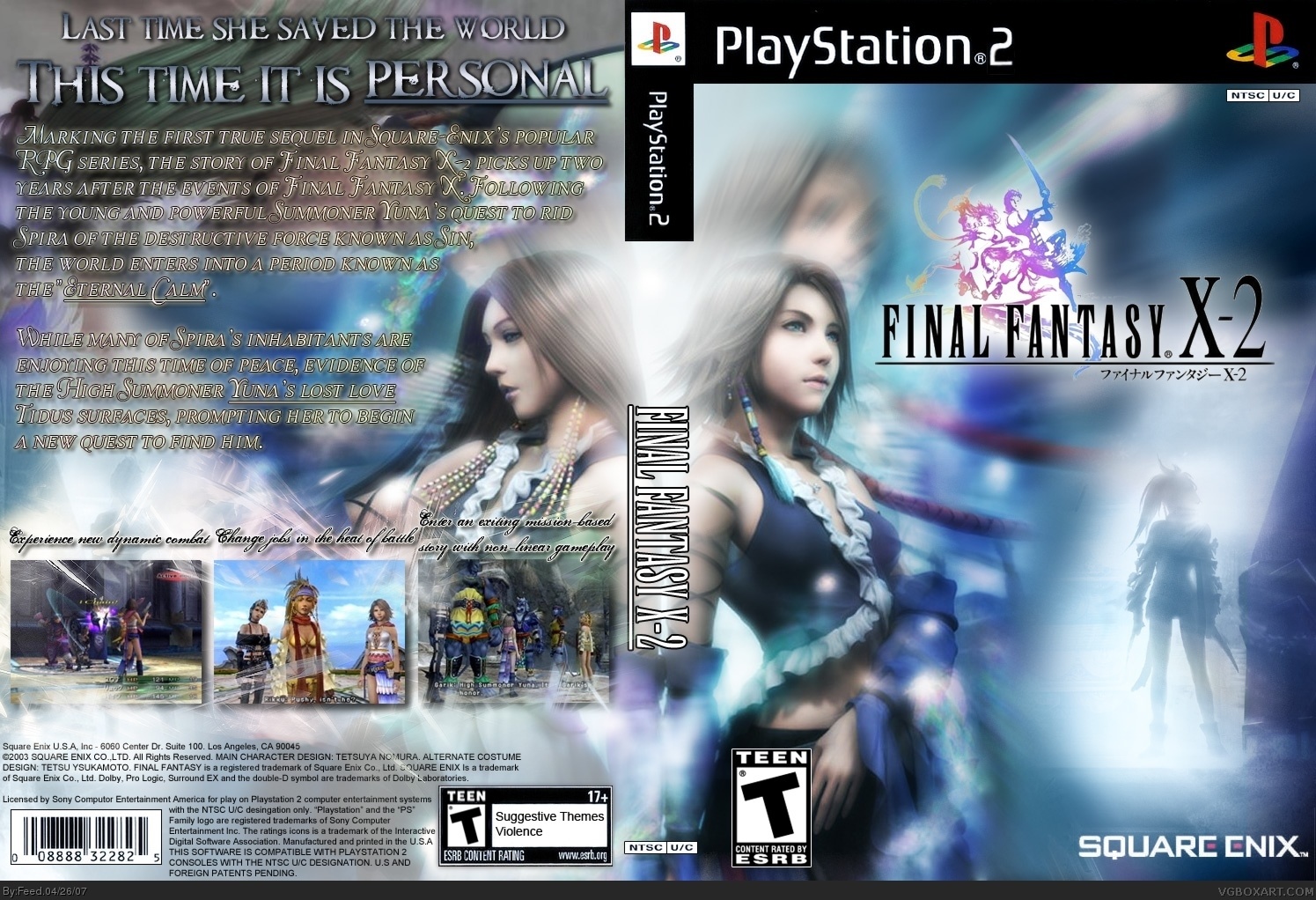
In a particular way this is very good from a designer's point of view, in the way you've presented the characters. I think on the back you overdid the style though. In my opinion a simpler text for the synopsis would looks more official and so more professional as long as it stands out. Very nice box overall.
#8, Nice update! I like that you can see Yuna's face now! and the addition of info buttons on the back (1 player etc) is nice.
I think you should play with the glow effects of the text, the off yellow... just looks like it shouldn't be there. Another color perhaps? play with it, See if anything else looks more appealing to the over all box. -Maybe a pure white text with a faint grey glow? I dunno.
Also, I was thinking if you dropped that same text just a tiny little bit to better form with the spherical shape of blue that is made with the background and the girl's hair (on the right) it would hit the sweet spot and make a perfect box.
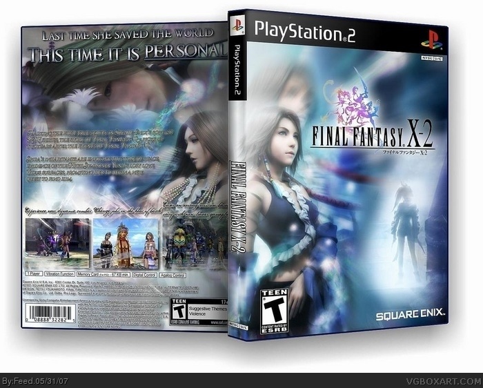
Something that would help this game look more realistic, I would change Riku on the front and put Tidus. Or just put Pain beside Riku cause the way you have the front cover it looks like you only play as Yuna
 Final Fantasy X-2 Box Cover Comments
Y.R.P. In position. It's showtime girls!
[ Reply ]
impressive.
[ Reply ]
In a particular way this is very good from a designer's point of view, in the way you've presented the characters. I think on the back you overdid the style though. In my opinion a simpler text for the synopsis would looks more official and so more professional as long as it stands out. Very nice box overall.
[ Reply ]
woooo... awesome!!
[ Reply ]
one question witch program did you use to do the letter?? and how did you do it?
[ Reply ]
This looks great!
Very stylish.
[ Reply ]
Gorgeous effects man! Seriously. I think you could of laid off the text in the back to show some of it off.
[ Reply ]
Updated
[ Reply ]
#8, Nice update! I like that you can see Yuna's face now! and the addition of info buttons on the back (1 player etc) is nice.
I think you should play with the glow effects of the text, the off yellow... just looks like it shouldn't be there. Another color perhaps? play with it, See if anything else looks more appealing to the over all box. -Maybe a pure white text with a faint grey glow? I dunno.
Also, I was thinking if you dropped that same text just a tiny little bit to better form with the spherical shape of blue that is made with the background and the girl's hair (on the right) it would hit the sweet spot and make a perfect box.
[ Reply ]
3D update.
[ Reply ]
this box makes the real one look like it was made by my 1 year old nephew. its awsome.
[ Reply ]
Incredible. This box made the oringinal look like crap. 5/5.
[ Reply ]
Wow.
[ Reply ]
Updated. Now in totally awesome quality. Enjoy and leave comments.
[ Reply ]
MY last post, I meant to give a 4.5/5 because of the color quality. Now since the color qualities better, I have no choice but to give a 5/5.
[ Reply ]
Something that would help this game look more realistic, I would change Riku on the front and put Tidus. Or just put Pain beside Riku cause the way you have the front cover it looks like you only play as Yuna
[ Reply ]
Bump.
[ Reply ]