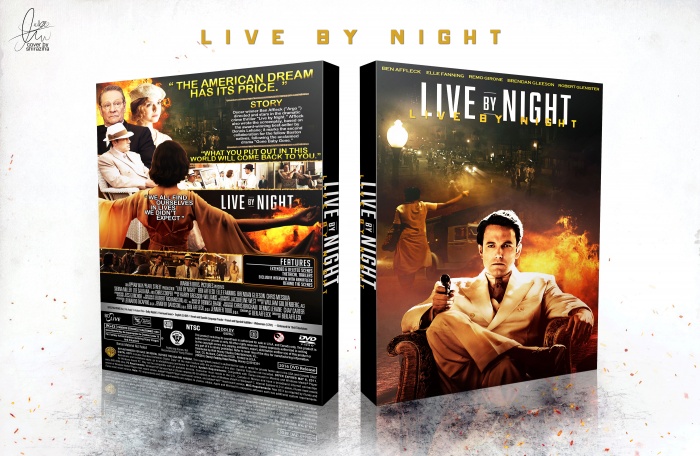
Looks nice. I agree about that quote on the lady's back. It seems out of place. The 'Live by Night' on the back seems redundant, as much as the repeat of 'Live by Night' on the front. I'd consider removing both and putting some other caption under the title instead, because it does seem to need something to balance it out if you do remove the front one.
On the back, once the 'Live by Night' is removed you'll be left with an odd negative space. However, what you can do is split the line you have on the bottom of the summary so it isn't so text heavy at the top.
Example:
"What you put out in this world..."
[SCREENSHOTS]
"...Will come back to you."
 Live By Night Box Cover Comments
Awesome man. The back is nicely balanced. I think it may look better without that quote on the back of the lady. Seems odd and just slapped on there.
[ Reply ]
ty for feedback bro ;)
[ Reply ]
Looks nice. I agree about that quote on the lady's back. It seems out of place. The 'Live by Night' on the back seems redundant, as much as the repeat of 'Live by Night' on the front. I'd consider removing both and putting some other caption under the title instead, because it does seem to need something to balance it out if you do remove the front one.
On the back, once the 'Live by Night' is removed you'll be left with an odd negative space. However, what you can do is split the line you have on the bottom of the summary so it isn't so text heavy at the top.
Example:
"What you put out in this world..."
[SCREENSHOTS]
"...Will come back to you."
Hope that makes sense. Anyway, good job.
[ Reply ]
yea , ty lucid , my old cover . sorry for no update , psd removed . but everytime ty for help me and send feedback ;)
[ Reply ]
Nice:)
[ Reply ]
ty ;)
[ Reply ]
Congrats bus . . .
[ Reply ]
ty matin ;)
[ Reply ]