Yep a new box by me , i had to resize the box cause the site didn't let me upload it .
here is a Bigger and better Version . please view this before commenting
High-Rez link : link
#1, the one you uploaded to imageshack is even smaller..........but from what i see, this box looks nice, but i dont really like that there is a bit too mch background going on and i think that template is pretty thick and it kinda takes away from the box.
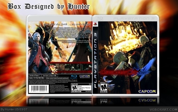
I think you got it wrong. From this day forward my arm changed? It's supposed to be from that day forth my arm changed. I know I'm a newbie, but I'm just stating the facts. Why does it say its rated teen on the back? It's hard to read the text on the back. Screen shot's could be a bit bigger. This box is okay. The information outside the box is not needed. Good background, bad execution. My final score: 4/5. And yeah, the Blu-Ray template is a bit thick. Use HellKnights.
#7, That version looks much prettier indeed. I gotta agree with Shady though that the canvas' background is too distracting, because of how big it is so you wanna shrink it down a notch.
I like the design of the front and how it's original but the image quality of the characters has much to be desired even if that's the disadvantage of using scan ins and that's kind of gets to me. The caption on the back also needs to be bolder. A really good effort though.
#8, ehm dude, no its not. Go on HellKnights page, pick a Playstation 3 box. Compare the two templates.
By the way Hunter, version 2 is much better! I like the high resolution link. Version 1 gets a 4/5, version 2 gets a 5/5. Sweet job Hunter.
#11, what ? i did used the official template just like Icarus said , i just edited it a bit to look better since the image of it wasn't in good quality. and HellKnight Template IS not the official template either even near the official template in looks and dimension's . believe me i have the official case right next to me so I'm sure .
#7, thanks dude ^^ ill try to shrink the canvas's background . and bold/change teh caption on the back.
#8, thanks mate =D
 Devil May Cry 4 Box Cover Comments
Yep a new box by me , i had to resize the box cause the site didn't let me upload it .
here is a Bigger and better Version . please view this before commenting
High-Rez link : link
[ Reply ]
wow!!!!
[ Reply ]
#1, the one you uploaded to imageshack is even smaller..........but from what i see, this box looks nice, but i dont really like that there is a bit too mch background going on and i think that template is pretty thick and it kinda takes away from the box.
[ Reply ]
#3, yeah i checked it out just now .... it seems that Imageshack don't accept images above 1700x1020 ~_~
[ Reply ]
I think you got it wrong. From this day forward my arm changed? It's supposed to be from that day forth my arm changed. I know I'm a newbie, but I'm just stating the facts. Why does it say its rated teen on the back? It's hard to read the text on the back. Screen shot's could be a bit bigger. This box is okay. The information outside the box is not needed. Good background, bad execution. My final score: 4/5. And yeah, the Blu-Ray template is a bit thick. Use HellKnights.
[ Reply ]
#5, sorry! I just realized that this site really kills the color! My apologizes, Hunter.
[ Reply ]
updated ,
full size 1700x1020 :http://www.deviantart.com/deviation/54590216/
[ Reply ]
[#5] Ehm dude, that's the official PS3 blu-ray case he used.
BTW nice box Hunter!
[ Reply ]
#7, That version looks much prettier indeed. I gotta agree with Shady though that the canvas' background is too distracting, because of how big it is so you wanna shrink it down a notch.
I like the design of the front and how it's original but the image quality of the characters has much to be desired even if that's the disadvantage of using scan ins and that's kind of gets to me. The caption on the back also needs to be bolder. A really good effort though.
[ Reply ]
*Pardon me, I meant may wanna.
[ Reply ]
#8, ehm dude, no its not. Go on HellKnights page, pick a Playstation 3 box. Compare the two templates.
By the way Hunter, version 2 is much better! I like the high resolution link. Version 1 gets a 4/5, version 2 gets a 5/5. Sweet job Hunter.
[ Reply ]
very very nice, i like it alot..Violence in the esrb info on the back needs a capital lol.
[ Reply ]
#11, what ? i did used the official template just like Icarus said , i just edited it a bit to look better since the image of it wasn't in good quality. and HellKnight Template IS not the official template either even near the official template in looks and dimension's . believe me i have the official case right next to me so I'm sure .
#7, thanks dude ^^ ill try to shrink the canvas's background . and bold/change teh caption on the back.
#8, thanks mate =D
[ Reply ]
I never saw this box. It is awesome.
[ Reply ]
one word... Perfect! 8-)
it's even better than the actual box art!!!
10/5 :D
[ Reply ]
i cant wait for this game
excellent box 4.5/5 i just think the back is a little crowded here and there
[ Reply ]