@Wolfenstein The Old If you do what you just want to see on your shelf, why bother asking anybody for advice when you post things? It won't matter, surely? You're only ever going to do what you want..
This is quite nice, similar layout to your last TR cover. If this was black, white and red I think it would look quite cool too.
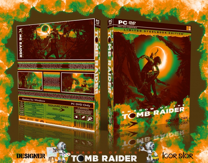
My suggestion would be to cut down the text on the back, seems to be quite a lot of it. Also maybe try having 3 screenshots in a row, that would line up with the 3 columns of text that are already there.
Thanks for the offer. I originally planned to have three screenshots but three screenshots of the same size seem too small to me.I would like to see clearly what is depicted on them.so I made a decision and left two thereby increasing their size.maybe I'll try to experiment with the overall design and color scheme. which you offer.thanks for the feedback i appreciate it..
 Shadow of the Tomb Raider Box Cover Comments
V 2
[ Reply ]
try using original colors 2 dont alwasy use gradians on all the cover
[ Reply ]
@CPT_KASRA original colors are not for me...I do what I want to see on my shelf...
[ Reply ]
@Wolfenstein The Old If you do what you just want to see on your shelf, why bother asking anybody for advice when you post things? It won't matter, surely? You're only ever going to do what you want..
[ Reply ]
@BenBrownDesign Some of the tips help me and some are not interesting so I choose the ones that interest me.something like this...
[ Reply ]
This is quite nice, similar layout to your last TR cover. If this was black, white and red I think it would look quite cool too.
My suggestion would be to cut down the text on the back, seems to be quite a lot of it. Also maybe try having 3 screenshots in a row, that would line up with the 3 columns of text that are already there.
[ Reply ]
Thanks for the offer. I originally planned to have three screenshots but three screenshots of the same size seem too small to me.I would like to see clearly what is depicted on them.so I made a decision and left two thereby increasing their size.maybe I'll try to experiment with the overall design and color scheme. which you offer.thanks for the feedback i appreciate it..
[ Reply ]
personally, i'm not a fan of the colors used.
they feel a little too bright for a game that's about the Mayan apocalypse.
as someone else mentioned, i think black, white and red would have been more suitable colors for this specific box.
........just my metaphorical two cents though.
[ Reply ]