Pretty good man, I would say your previous case is still a bit better. Just has a bit more flare with the screenshots and back layout, this seems more standard.
You could try and move the bullet points to the right hand side of the back. Bring down the game summary to where the bullet points are now. The with all the space at the top, you could really play with the heading and make it really eye catching. links are some examples link link
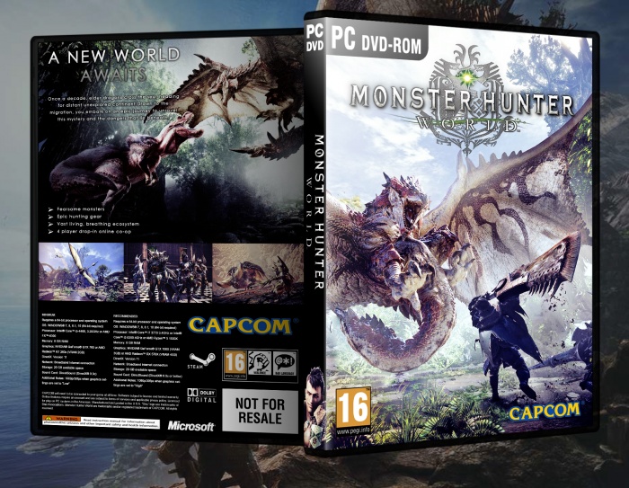
 Monster Hunter World Box Cover Comments
Pretty good man, I would say your previous case is still a bit better. Just has a bit more flare with the screenshots and back layout, this seems more standard.
You could try and move the bullet points to the right hand side of the back. Bring down the game summary to where the bullet points are now. The with all the space at the top, you could really play with the heading and make it really eye catching. links are some examples
link
link
[ Reply ]