It’s been awhile, VGBOXART. Sad to see that this site is about dead, needs some resurrecting I think.
[ Box updated on November 26th, 2018 ] [ original ]
 Anthem Box Cover Comments
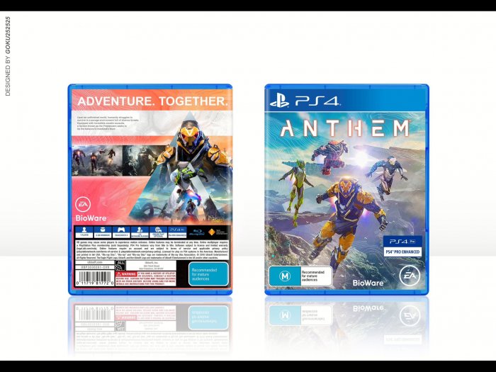
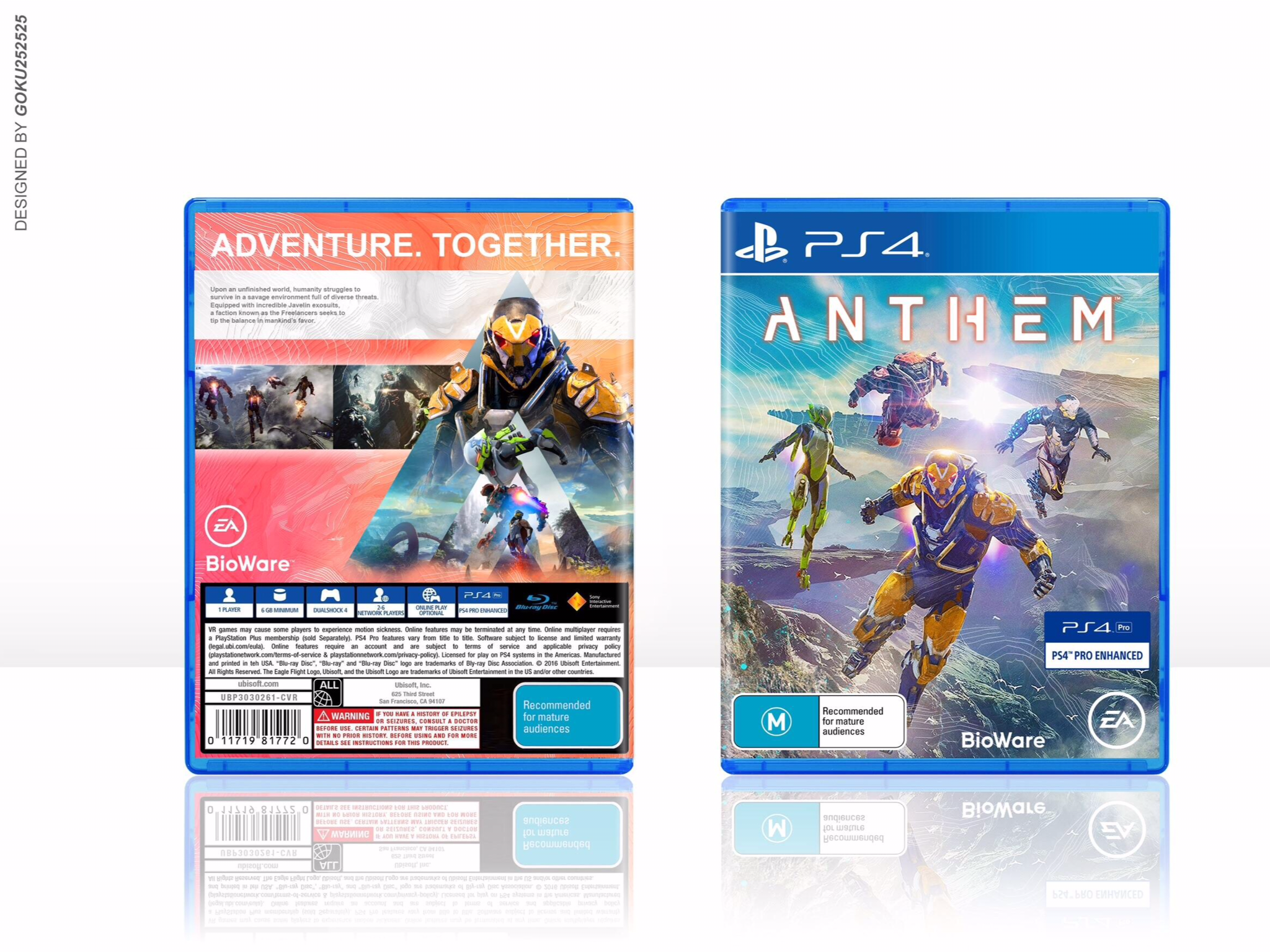
Comment on goku252525's Anthem Box Art / Cover.
the front's looking good, though i feel like you could incorporate some of the color from the back onto it, to make it more consistent. the back just seems a tad empty in my opinion, could use with more flavor text on the white box there, and maybe some features on the space under it and not just the ea and bioware logo
[ Reply ]
Thanks for the comment man! Yeah that was my original idea, to feature some more of those peachy colours on the front, unfortunately couldn’t get it to look how I had in my head! I’m quite happy with the colour scheme now, I think the front and back compliment each other nicely and are well balanced, the front is mostly blue and cool colours but with pops of warm and the back is mostly warm with pops of cool.
As for the sparseness of the back you are completely right! I knew I should’ve put a bit more text in those areas I just got lazy if I’m to be honest. If I end up creating a printable I’ll sort that out.
[ Reply ]
not bad... Printable?
[ Reply ]
Damn, I really love this!
[ Reply ]