It might look a lot better if you tone the effects on the text of the back, add colour to the back like the front. I would go for a plainer background, behind the boxes as those faces are rather distracting.
Just my opinion though, do what you like the best. :)
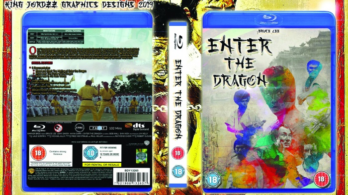
 Enter The Dragon Box Cover Comments
It might look a lot better if you tone the effects on the text of the back, add colour to the back like the front. I would go for a plainer background, behind the boxes as those faces are rather distracting.
Just my opinion though, do what you like the best. :)
[ Reply ]