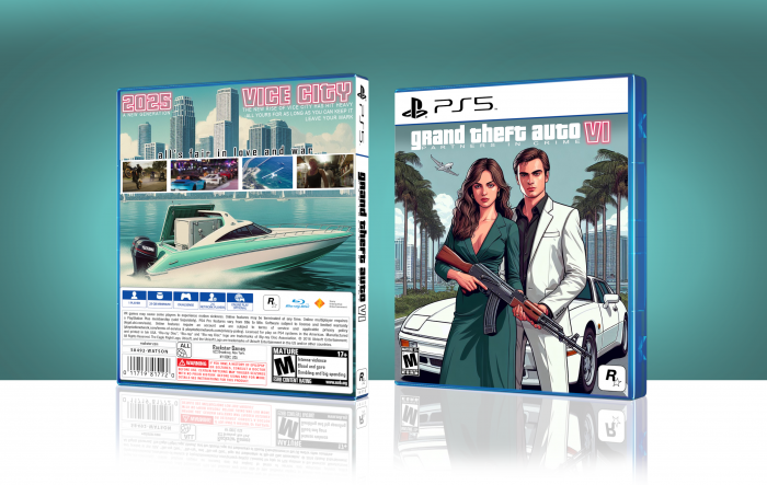
Fourteen years have passed - since this site set off my love for graphic design. This one is dedicated to VGBoxArt - it's not dead.
 Grand Theft Auto VI Box Cover Comments
Comment on Pepper Rush's Grand Theft Auto VI Box Art / Cover.

Mmmm No... That box is very rare
[ Reply ]
Hi Warsony! "No" to what?
[ Reply ]
I like it, super clean and tidy. Good work Pepper
[ Reply ]
Thanks a lot, Vince! I appreciate it.
[ Reply ]
@Pepper Rush Making anymore?
[ Reply ]
@Vince_1990 You are very generous Vince :O
[ Reply ]
@Vince_1990 Yes, I am planning to make more.
[ Reply ]
@Warsony :D
[ Reply ]
I think it needs more polishing, the box is incomplete on the back, the images are poorly organized, I don't like how they line up. The font above the screenshots is also not surprising, it is a very basic font. The template you used in question is from a Ps4 Pro game, I would have liked you to take the trouble to do it yourself and for it to be for Ps5, I mean the game credits (For example "2016 Ubisoft??" WTF???). The main cover is very empty, two characters, a car, the color tone is very white, I feel everything is very dull, nothing striking, nothing that stands out and not to mention the title of the game, I don't like it at all. This work needs to be finished and improved.
[ Reply ]
Thank you for the criticism. The images on the back could have been organized differently. The premise for my box is minimalism, but I see your point towards my choice of text. For the small text - yes, there's no excuse to not polish up even the smallest of details, so I won't give you an excuse. The title however, I must disagree with you - have a look at modern marketing; 3D is gone, gradients are gone, outlines are gone. Look up GTA VI's official "coming soon poster". -They made the same choice. In my opinion - that black outline would set us 10, if not 20 years back in time. This is a present time game - both in wrapping and software. I encourage your criticism.
[ Reply ]
@Pepper Rush You may be right about part of the last thing you mentioned, but when something goes wrong in the painting you can't applaud the work. In my opinion it needs more touches to surprise me. Another criticism and no less important is that the back part where the boat is also feels very empty. The fonts and images you used are not the best. But you have potential, if you know how to use it better, you can create better boxes with better results. I encourage you to try harder.
[ Reply ]
@Warsony Thanks for your opinions, Warsony.
[ Reply ]