first of all the top of the pics head is trimmed off badly. the blue aura stuff around him is just to cover up the cut between your two pictures and your logo is too high up and
your template looks rubbish with the chopped reflection. 1/5. better luck next time.
PS: thnx for your comment on my box
 Final Fantasy Versus XIII Box Cover Comments
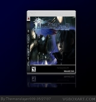
2cnd box yeah coulda made it better but there isnt much pics of ff13 versus yet. comments plz :)
[ Reply ]
2nd*
[ Reply ]
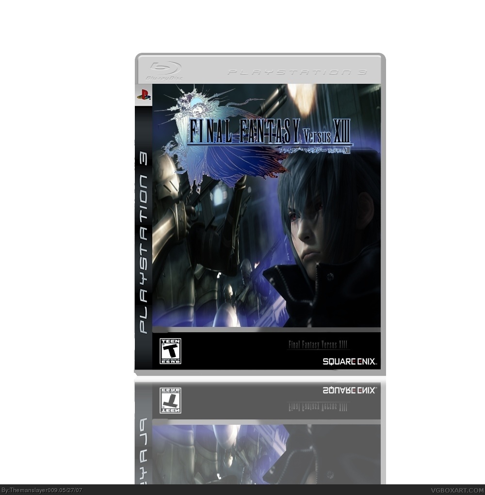
it looks kinda cool, but the white seems unproffesional.. and the glow kinda annoys.
[ Reply ]
credit to hellknights !
for template
[ Reply ]
#3 what u mean white the background?
[ Reply ]
the logo is a bit choppy and the reflection is not really good and the white background is too... too ... White!! 3.5/5
[ Reply ]
hmm
[ Reply ]
im gonna update it so reflection is better and not white lol
[ Reply ]
look in the forum, a treat was started, how to reflect an image in cs2 look there and open the link
[ Reply ]
THX
[ Reply ]
yay, go ayron, for starting the thread,
looks way better now!
[ Reply ]
you reflection just stops...
and what is with that big black area?
[ Reply ]
first of all the top of the pics head is trimmed off badly. the blue aura stuff around him is just to cover up the cut between your two pictures and your logo is too high up and
your template looks rubbish with the chopped reflection. 1/5. better luck next time.
PS: thnx for your comment on my box
[ Reply ]
lol dont get angry kid
[ Reply ]
nice.
[ Reply ]